Not quite sure I follow your argument. If both predictor variables in your model are assumed continuous, then the model summary should report an estimated intercept (b0), an estimated coefficient for temperature change (b1), an estimated coefficient for plant productivity (b2) and an estimated coefficient for the interaction between temperature change and plant productivity (b3). The summary of the model output will report these values in the column titled Estimate - since I don't know what they are, I called them b0, b1, b2 and b3. Thus, the expected (or average) plant biomass change can be expressed as:
Expected plant biomass change = b0 + b1*(temperature change) + b2*(plant productivity) +
                                b3*(temperature change)*(plant productivity).
Because the model includes an interaction term, the effect of plant productivity on expected plant biomass change actually depends on temperature change. You can see this by re-arranging the above equation:
Expected plant biomass change = [b0 + b1*(temperature change)] + [b2 + b3*(temperature change)]*(plant productivity).
The intercept and slopes describing the relationship between plant productivity are given by:
Intercept: [b0 + b1*(temperature change)]

Slope:      [b2 + b3*(temperature change)]
For example, if the temperature change is zero degrees (Celsius?), then:
Expected plant biomass change = b0 + (b2 + b3)*(plant productivity).
As Peter suggested, you can choose several representative values for temperature change and then plot the corresponding lines obtained by substituting those representative values in the expressions of the above Intercept and Slope. Those lines would describe how the expected plant biomass change varies as a function of plant productivity.
To decide which representative values of temperature change to consider, you can plot the distribution of temperature changes observed in your study. If that distribution looks approximately normal, you can choose the average temperature change (m), as well as m - sd and m + sd, say, where sd is the standard deviation of that distribution. If the distribution is unimodal but skewed, you could replace m with the median and sd with the interquartile range of the distribution.
Plotting lines with different intercepts and slopes would allow you to see how the effect of plant productivity on expected plant biomass change depends on particular, representative values of temperature change. It's possible that some slopes will be positive, while others will be negative. In that case, you can note that the effect changes direction, etc.
Addendum:
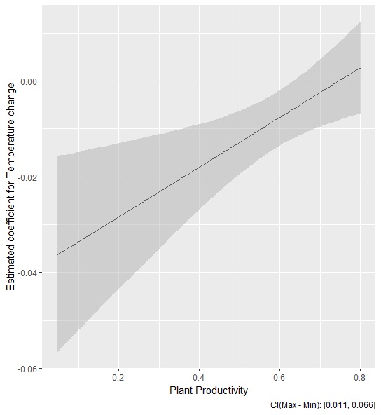
If I understand @gung correctly, I think what you did was to re-express the first equation I wrote like so:
Expected plant biomass change = [b0 + b2*(plant productivity)] +
[b1 + b3*(plant productivity)]*(temperature change)
and then plot b1 + b3*(plant productivity) versus productivity to see how the rate of change in expected plant biomass change varies as a function of plant productivity. What is not clear to me though is how you computed the confidence band around b1 + b3*(plant productivity)? Did you compute the standard error (SE) of b1 + b3*(plant productivity) and then computed pointwise confidence bands via the formula b1 + b3*(plant productivity) +/- 1.96 SE? (The SE should take into account the correlation between b1 and b3). Or perhaps you used a critical value from a t-distribution instead of 1.96, with degrees of freedom given by the residual degrees of freedom?


a*bin a linear model (as fit bylm) usually only makes sense if at least one ofaandbis categorical. Is this the case? $\endgroup$