2
$\begingroup$

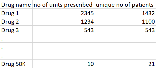
I have data like as shown below

enter image description here

I would like to represent the above tabular data in a visual form.

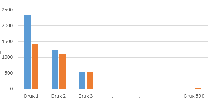
However, the below graph may not work because my real data as 50K unique drug names. Doing so, will make the x-axis messy. Is there any other condensed way to represent this?

enter image description here

So, is there any better way to represent this? Can you share some suggestions on how this can be represented?

$\endgroup$

1 Answer 1

3
$\begingroup$

What would you like to communicate with the plot?

For a summary of the dataset, you can think about a scatter plot with x = unique no patients, y = no of units prescribed and put a label close to each point representing the drug id.
This is an example with the dataset mtcars

library("ggplot2")
data("mtcars")

mtcars$mdl <- rownames(mtcars)
ggplot(mtcars, aes(x=mpg, y=wt, label=mdl)) +
  geom_point() +
  geom_text(check_overlap=TRUE, vjust="inward", hjust="inward")
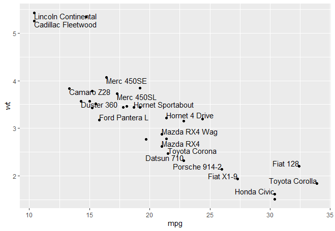
enter image description here

Set check_overlap=FALSE if you want to see all (overlapping) labels.

Since you have a large number of points, you may want to label just those that can be informative about how the data is distributed. To do that, you can do a scatter plot

plot(x=mtcars$mpg, y=mtcars$wt)

then use identify to click on the points you want to label

identify(x=mtcars$mpg, y=mtcars$wt, labels=mtcars$mdl, cex=0.8)

You have to click on the points that you want to label, then press ESC.

If you want to do it programmatically, you can set all labels to NA except those that you want to show:

mtcars$mdl_1 <- mtcars$mdl
mtcars$mdl_1[-sample(nrow(mtcars), 5)] <- NA  # Select 5 random to keep

ggplot(mtcars, aes(x=mpg, y=wt, label=mdl_1)) +
  geom_point() +
  geom_text(check_overlap=FALSE,vjust="inward",hjust="inward")

More than 2 variables:

In this case, you can use pairs or ggpairs from GGally package

library(GGally)

mtcars$mdl <- rownames(mtcars)
mtcars$mdl_1 <- mtcars$mdl
mtcars$mdl_1[-sample(nrow(mtcars), 5)] <- NA  ## Showing 5 random labels

gg <- ggpairs(data=mtcars, columns=c(1:5), aes(label=mdl_1))
for (i in 1:25) {  ## 5*5 plots
  for (j in 1:25) {
    if (j < i) {  ## lower half
      plt <- getPlot(gg,i,j) + geom_text(size=3) + geom_point(size=1)
      gg <- putPlot(gg,plt,i,j)
    }
  }
}

gg
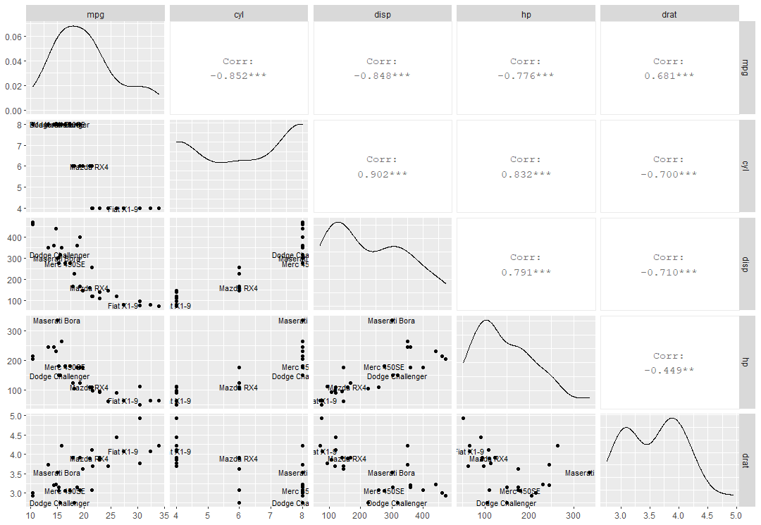
enter image description here

where I've customized the scatter plots using the method described here.

$\endgroup$
7
  • $\begingroup$ Thanks for the response. Upvoted. good to know this approach. But Is there anyway to hide names as well? Because I think my drug names might be lengthy. Instead if I would like to show just as cluster points without names, is it possible? $\endgroup$
    – The Great
    Commented Jul 6, 2020 at 13:17
  • $\begingroup$ I've updated the answer with a method to label only the points chosen by you. This is done interactively. If you set the labels to NA, they won't be shown. $\endgroup$
    – user289381
    Commented Jul 6, 2020 at 13:20
  • $\begingroup$ Fantastic. Thank you. In addition, I actually have another 3-dimensional axis problem. can help me with that as well? $\endgroup$
    – The Great
    Commented Jul 6, 2020 at 13:21
  • $\begingroup$ I'm gonna update the answer for such case. $\endgroup$
    – user289381
    Commented Jul 6, 2020 at 13:22
  • $\begingroup$ May I know how do we set the axis interval instead of the code automatically picking up one? mtcars$mdl <- rownames(mtcars) ggplot(mtcars, aes(x=mpg, y=wt, label=mdl)) + geom_point() + geom_text(check_overlap=TRUE, vjust="inward", hjust="inward") $\endgroup$
    – The Great
    Commented Jul 6, 2020 at 13:44

Your Answer

By clicking “Post Your Answer”, you agree to our terms of service and acknowledge you have read our privacy policy.

Not the answer you're looking for? Browse other questions tagged or ask your own question.