2
$\begingroup$

Why are the results from the linear spline regression showing physiologically implausible coefficients?

For example, consider the following formula:

model_nstatin <- lm(ldl ~ 
                    bs(pa, knots = c(600, 2400, 4200), degree = 1) + 
                    bs(age, knots = c(45, 55, 65), degree = 1) + 
                    sex + education + smoking + 
                    bs(mds, knots = c(4, 7), degree = 1), 
                    data = chol_nstatin)

This model yields an intercept of 3.42 and spline coefficients for physical activity (measured in MET min/week) as follows:

  • -0.047 for values less than 600
  • -0.091 for values between 600 and 2400
  • -0.112 for values between 2400 and 4200 and
  • -0.102 for values greater than or equal to 4200

These coefficients are for LDL cholesterol measured in mmol/L. However, the predictions and the plot provided below are mathematically and physiologically reasonable. Why do the spline coefficients appear incorrect physiologically (LDL cannot be negative)? For example, if PA is 300, the corresponding LDL value will be -10.68.

Here's the code used for prediction and plotting:

nstatin <- data.frame(
  pa = seq(min(chol_nstatin$pa), max(chol_nstatin$pa), 
            length.out = 117283),
  age = mean(chol_nstatin$age),
  sex = factor("Male", levels = levels(chol_nstatin$sex)),
  education = factor("Vocational", 
                     levels = levels(chol_nstatin$education)),
  smoking = factor("Ex-smoker", 
                levels = levels(chol_nstatin$smoking)),
  mds = mean(chol_nstatin$mds)
)

predictions_nstatin <- predict(model_nstatin, newdata = nstatin, 
                               interval = "confidence")

nstatin$ldl_pred <- predictions_nstatin[, "fit"]
nstatin$lower <- predictions_nstatin[, "lwr"]
nstatin$upper <- predictions_nstatin[, "upr"]

knots <- c(600, 2400, 4200)
x_limit <- 6000
x_interval <- 600

ggplot(nstatin, aes(x = pa, y = ldl_pred)) +
  geom_line(linewidth = 1.2, color = "red") +
  geom_ribbon(aes(x = pa, ymin = lower, ymax = upper), 
              fill = "lightblue", alpha = 0.2) +
  geom_vline(xintercept = knots, linetype = "dashed", 
             color = "blue")  + 
  scale_x_continuous(
    limits = c(0, x_limit),
    breaks = seq(0, x_limit, by = x_interval),
    labels = seq(0, x_limit, by = x_interval)
  ) +
  labs(title = "Linear Spline Fit with Confidence Intervals", 
       x = "Physical activity (MET min/week)", 
       y = "LDL cholesterol (mmol/L)") +
  theme_minimal()
$\endgroup$
1
  • 3
    $\begingroup$ How do you determine the "should be" values? $\endgroup$
    – whuber
    Commented Aug 22 at 19:28

2 Answers 2

3
$\begingroup$

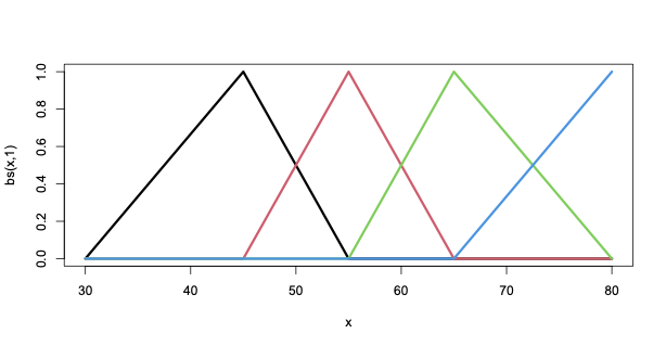
I think the problem is that you are using a different spline basis from the one you think you are using. This is the linear b-spline basis with knots at 45,55,65.

enter image description here

If you want the coefficients to be the slopes on each interval, you need to define that basis yourself

agel45=pmin(45,age)
age45t55 = pmin(55,pmax(45,age))
age55t65 = pmin(65,pmax(55,age))
ageg65 = pmax(65,age)

If you want the first coefficient to be the slope on the first interval and the other coefficients to be the changes in slope at the knots

agel45=pmin(45,age)
change45=pmax(0, age-45)
change55=pmax(0, age-55)
change65=pmax(0, age-65) 

The b-spline basis from bs is designed to minimise correlation between the basis functions rather than for interpretability. It's most useful for degree>1, where the individual coefficients aren't easily interpretable anyway.

$\endgroup$
2
  • 2
    $\begingroup$ You can probably get everything you need (predictions, predicted slopes, etc.) from some combination of predict() and emmeans::emtrends(). Now that the question is not "why don't the coefficients make sense?" but "how do I derive [quantity X] and plot it?", this is turning back into a Stack Overflow question. If you can post a focused question there with a reproducible example, I'm sure someone will answer it.[ $\endgroup$
    – Ben Bolker
    Commented Aug 23 at 12:46
  • $\begingroup$ This code doesn't seem correct, or I might have misunderstood how linear splines work. Here’s what I have: {r } pa600 = pmin(600, pa) change600 = pmax(0, pa - 600) change2400 = pmax(0, pa - 2400) change4200 = pmax(0, pa - 4200) Assuming physical activity (pa) levels with knots at 600, 2400, and 4200, here’s how the code should work: • If pa is 437, seems good. • If pa is 2133, all good. But • If pa is 4100, I thought change600 should be 1800. • If pa is 4238, I expect change2400 & change4200 to be 1800 & 1800 respectively. Am I misunderstanding how linear splines work? $\endgroup$
    – Tek
    Commented Aug 26 at 9:29
1
$\begingroup$

Following up on @ThomasLumley's answer, it looks like the cplm package has a function for truncated polynomial spline bases, although it doesn't necessarily integrate nicely with lm() (it splits the basis into X, a component that would be unpenalized in the context of penalized regression splines, and Z) ... you could use lm.fit(y, cbind(1, ss$X, ss$Z)) (see below) to get the coefficients.

library(cplm)
library(cplm)
xvec <- 30:80
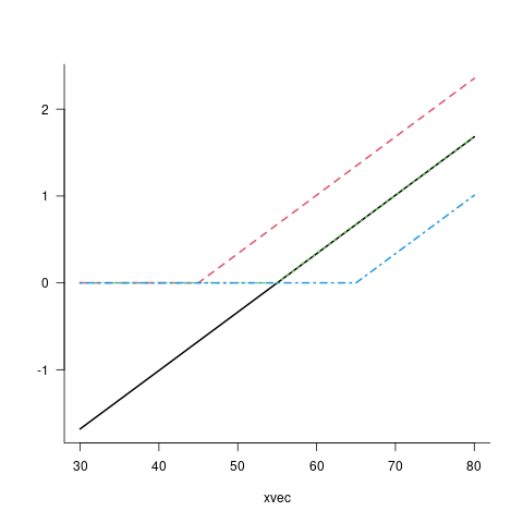
ss <- tp(xvec, knots = c(45,55,65), k = 4, degree = 1)
par(las=1, bty = "l")
matplot(xvec, cbind(ss$X,ss$Z), type = "l", lwd =2, ylab = "")

image of the truncated linear spline basis: the unpenalized component is a black line with slope and x-intercept at the mean of the data. The other components are piecewise linear, flat before the knot and linear with slope 1 after

$\endgroup$

Your Answer

By clicking “Post Your Answer”, you agree to our terms of service and acknowledge you have read our privacy policy.

Not the answer you're looking for? Browse other questions tagged or ask your own question.