Suppose your multiple regression equation was
$$\hat y = 2 x_1 + 5 x_2 + 3$$
where $\hat y$ means "predicted $y$".
Now take just those points for which $x_2 = 1$. Then if you plot $\hat y$ against $x_1$, these points will satisfy the equation:
$$\hat y = 2 x_1 + 5(1) + 3 = 2 x_1 + 8$$
So they must lie on a line of slope 2 and with $y$-intercept 8.
Now take those points for which $x_2 = 2$. When you plot $\hat y$ against $x_1$, then these points satisfy:
$$\hat y = 2 x_1 + 5(2) + 3 = 2 x_1 + 13$$
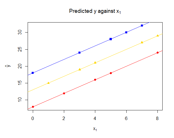
So that's a line of slope 2 and with $y$-intercept 13. You can verify for yourself that if $x_2=3$ then you get another line of slope 2 and $y$-intercept is 18.
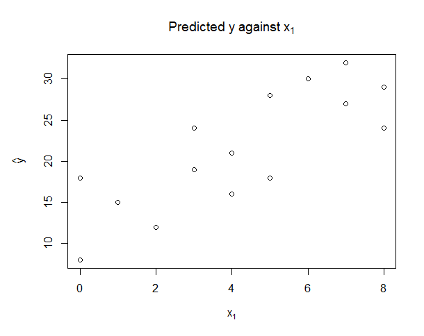
We see that points with different values of $x_2$ will lie on different lines, but all with the same gradient: the meaning of the coefficient of $2x_1$ in the original regression equation is that, ceteris paribus i.e. holding other predictors constant, a one unit increase in $x_1$ increases the predicted mean response $\hat y$ by two units, while the meaning of the intercept of $3$ in the regression equation was that when $x_1 = 0$ and $x_2 = 0$ then the predicted mean response is $3$. But not all your points have the same $x_2$, which means they lie on lines with a different intercept — the line would only have intercept $3$ for those points for which $x_2=0$. So rather than seeing a single line, you may see (if there are only certain values of $x_2$ that occur, for instance if $x_2$ is always integer) a series of diagonal "streaks". Consider the following data, where $\hat y = 2 x_1 + 5 x_2 + 3$.

Here there are perceptible "streaks". Now if I colour in those points for which $x_2=1$ as red circles, $x_2=2$ as gold triangles and $x_2=3$ as blue squares we see they lie on three distinct lines, all of slope 2, and $y$-intercepts 8, 13 and 18 as calculated above. Of course, if $x_2$ wasn't constrained to take integer values, or the situation was complicated by other predictor variables being included in the regression, then the diagonal streaking would be less clear, but it would still be the case that each predicted point lies on a separate line based on the values of the other predictors not shown on the graph.

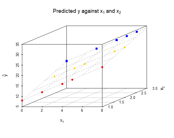
If you were to plot a 3-dimensional graph of $y$ against $x_1$ and $x_2$, then your predicted points all lie in the two-dimensional plane with equation $\hat y = 2 x_1 + 5 x_2 + 3$. The $y$ versus $x_1$ graph I described above is a projection of that three-dimensional graph onto two dimensions — imagine lining yourself up with the $x_2$-axis so you are looking straight down it, while the $y$-axis points upwards and the $x_1$-axis points to your right.

Note that all the points lie in a flat plane precisely because I have drawn the fitted (i.e. predicted) $y$ values. If we drew a plot using the observed $y$ values then these will lie vertically above or below these points, depending on whether the residual is positive or negative respectively.
The relationship between $\hat y$ and $x_1$ is linear when $x_2$ is controlled for (i.e. for constant $x_2$, the relationship between $\hat y$ and $x_1$ is a straight line), which is often described as "partialling out" the effect of $x_2$. If you want to draw a plot showing the relationship between $y$ and $x_1$ taking into account the variation in $x_2$ then you can use a "partial regression plot" (also called "added variable plot"), where the relationship between $y$ and $x_1$ will be drawn as a single straight line.
Code for R plots
library(scatterplot3d)

data.df <- data.frame(
  x1 = c(0,2,4,5,8, 1,3,4,7,8, 0,3,5,6,7),
  x2 = c(1,1,1,1,1, 2,2,2,2,2, 3,3,3,3,3)
)

data.df$yhat <- with(data.df, 2*x1 + 5*x2 + 3)

data1.df <- data.df[data.df$x2==1,]
data2.df <- data.df[data.df$x2==2,]
data3.df <- data.df[data.df$x2==3,]

#Before lines added
mar.default <- c(5,4,4,2) + 0.1
par(mar = mar.default + c(0, 1, 0, 0))
plot(data.df[c("x1","yhat")], main=expression("Predicted y against "*x[1]),
     xlab=expression(x[1]), ylab=expression(hat(y)))

#After lines added
plot(data.df[c("x1","yhat")], main=expression("Predicted y against "*x[1]),
     xlab=expression(x[1]), ylab=expression(hat(y)), pch=".")
points(data1.df[c("x1","yhat")], pch=19, col="red")
abline(lm(yhat ~ x1, data=data1.df), col="red")
points(data2.df[c("x1","yhat")], pch=17, col="gold")
abline(lm(yhat ~ x1, data=data2.df), col="gold")
points(data3.df[c("x1","yhat")], pch=15, col="blue")
abline(lm(yhat ~ x1, data=data3.df), col="blue")

#3d plot
myPlot <- scatterplot3d(data.df, pch=".", xlab=expression(x[1]),
                        ylab=expression(x[2]), zlab=expression(hat(y)),
                        main=expression("Predicted y against "*x[1]*" and "*x[2]))
myPlot$plane3d(Intercept=3, x.coef=2, y.coef=5, col="darkgrey")
myPlot$points3d(data1.df, pch=19, col="red")
myPlot$points3d(data2.df, pch=17, col="gold")
myPlot$points3d(data3.df, pch=15, col="blue")
print(myPlot)


