11
$\begingroup$

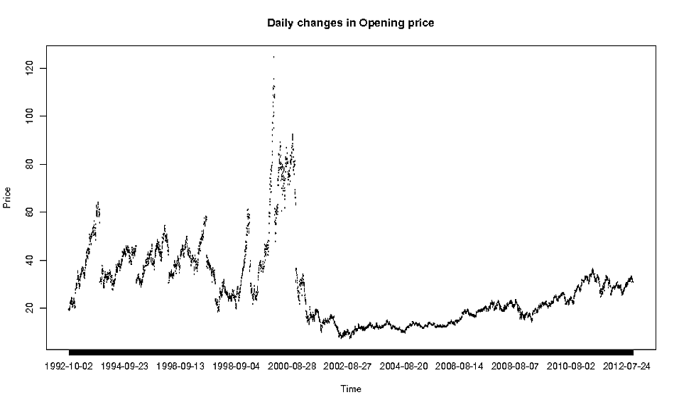
I have the following dataset: https://dl.dropbox.com/u/22681355/ORACLE.csv and would like to plot the daily changes in 'Open' by 'Date', so I did the following:

oracle <- read.csv(file="http://dl.dropbox.com/u/22681355/ORACLE.csv", header=TRUE)
plot(oracle$Date, oracle$Open, type="l")

and I get the following:

enter image description here

Now this is obviously not the nicest plot ever, so I'm wondering what is the right method to use when plotting such detailed data?

$\endgroup$
3
  • 1
    $\begingroup$ The plot actually isn't so bad.... but how to improve it depends on what you want to emphasize. Do you want to just plot weekly data? Do you want to add a smooth line? You ought to change the x-axis labels, certainly.... $\endgroup$
    – Peter Flom
    Commented Oct 12, 2012 at 11:33
  • $\begingroup$ Yes I would like to have smooth lines, like this for example: dl.dropbox.com/u/22681355/Untitled.tiff, it's ok if the scale is in years, but the smooth line would be essential. I've tried to change the type to "l" but it didn't really do anything. $\endgroup$
    – dbr
    Commented Oct 12, 2012 at 11:39
  • $\begingroup$ In R one way to add smooth lines is loess. I am on my way out, but try ?loess in R and, if you have trouble, edit your post and someone will certainly be able to help you. There are other smoothing methods, too, but I think loess is a good default. $\endgroup$
    – Peter Flom
    Commented Oct 12, 2012 at 11:45

4 Answers 4

9
$\begingroup$

The problem with your data is not that it is extremely detailed: you have no values at weekends, that's why it is plotted with gaps. There are two ways to deal with it:

  1. Either try to guess approximate values in weekends with some smoothing methods (smooth.spline, loess, etc.). Code of simple interpolation is below. But in this case you will introduce something "unnatural" and artificial to the data. That's why I prefer second option.
currentDate <- min(as.Date(oracle$Date))
dates <- c(currentDate)
openValues <- c(oracle$Open[5045])
i <- 5044
while (i > 0) {
  currentDate <- currentDate + 1;
  dates <- c(dates, currentDate)
  if (currentDate == as.Date(oracle$Date[i])) {
        # just copy value and move
        openValues <- c(openValues, oracle$Open[i])
        i <- i-1
      } else {
        # interpolate value
        openValues <- c(openValues, mean(oracle$Open[i:i-1]))
  }
}
plot(dates, openValues, type="l")
  1. You can go from daily basis to a weekly basis, just averaging (for example) five sequential points that belog to one week (in this case you are "killing" some information). Just a quick example of how to do that would be
openValues = c(mean(oracle$Open[1:5]));
dates = c(as.Date(oracle$Date[1]));
for (i in seq(6,5045,5)) {
  openValues = c(openValues, mean(oracle$Open[i:i+5]));
      dates = c(dates, as.Date(oracle$Date[i]));
}
plot(dates, openValues, type="l")

Hope it will help.

$\endgroup$
4
  • 1
    $\begingroup$ thanks, this is really helpful. the problem is that since this is stock data, turning from daily to weekly basis could definitely 'kill' some crucial data. Is there any way to have smooth lines for the days and empty spaces for weekends? $\endgroup$
    – dbr
    Commented Oct 12, 2012 at 12:57
  • $\begingroup$ Ok, if it's important for you not to average, then I have updated the answer, providing the sample code of interpolating the weekends. $\endgroup$ Commented Oct 12, 2012 at 13:18
  • $\begingroup$ @dbr By the way, if you want to rely on R in interpolation, that would be extremely easy: plot(as.Date(oracle$Date), oracle$Open, type='l') $\endgroup$ Commented Oct 12, 2012 at 14:29
  • 1
    $\begingroup$ And in case you just simply want gaps when weekends, replace the line openValues <- c(openValues, mean(oracle$Open[i:i-1])) in the first method with openValues <- c(openValues, NA) $\endgroup$ Commented Oct 12, 2012 at 14:32
10
$\begingroup$

Because the problem is common to many statistical software environments, let's discuss it here on Cross Validated rather than migrating it to an R-specific forum (such as StackOverflow).

The real issue is that Date is treated as a factor--a discrete variable--and so the lines are not being connected properly. (Nor are the points being plotted perfectly accurately in the horizontal direction.)
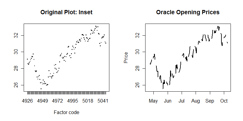
Plot comparison

To make the righthand plot, the Date field was converted from a factor to an actual date, each week was identified with a simple calculation (breaking the weeks between Saturday and Sunday) and the lines were interrupted over weekends by looping over the weeks:

oracle$date <- as.Date(oracle$Date)
oracle$week.num <- (as.integer(oracle$date) + 3) %/% 7 
oracle$week <- as.Date(oracle$week.num * 7 - 3, as.Date("1970-01-01", "%Y-%m-%d"))

par(mfrow=c(1,2))
plot(as.factor(unclass(oracle$Date[1:120])), oracle$Open[1:120], type="l",
     main="Original Plot: Inset", xlab="Factor code")
plot(oracle$date[1:120], oracle$Open[1:120], type="n", ylab="Price", 
     main="Oracle Opening Prices")
tmp <- by(oracle[1:120,], oracle$week[1:120], function(x) lines(x$date, x$Open, lwd=2))

(A date equivalent of each week, giving the Monday of that week, was also stored in the oracle dataframe because it can be useful for plotting weekly aggregated data.)

The original intention can be achieved simply by emulating the last line to display all the data. To add some information about seasonal behavior, the following plot varies the color by week throughout each calendar year:

par(mfrow=c(1,1))
colors <- terrain.colors(52)
plot(oracle$date, oracle$Open, type="n", main="Oracle Opening Prices")
tmp <- by(oracle, oracle$week, 
          function(x) lines(x$date, x$Open, col=colors[x$week.num %% 52 + 1]))
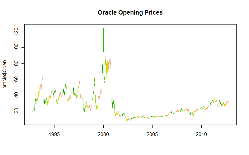
Final plot

$\endgroup$
6
  • $\begingroup$ Not a finance person, but I like the seasonal trending trick. $\endgroup$ Commented Oct 12, 2012 at 16:19
  • $\begingroup$ @John Originally the color was added just to aid the eye. But having looked at the result, I find it interesting that in five of the six years preceding the Internet stock blowup in 2000, the orange weeks (roughly late summer) all exhibited strong upward trends. Afterwards, that tendency appears to have vanished. $\endgroup$
    – whuber
    Commented Oct 12, 2012 at 16:23
  • $\begingroup$ I notice that too, and wondered what the relationship, if any, was. $\endgroup$ Commented Oct 12, 2012 at 16:38
  • $\begingroup$ whuber and @John Robertson - Might not be too closely related but 1998 was also when Microsoft moved to their modern codebase with Sql Server 7.0/Sql Server 2000 and by 2000 they were providing stronger competition to Oracle: en.wikipedia.org/wiki/Microsoft_SQL_Server#Genesis $\endgroup$
    – Rob
    Commented Oct 13, 2012 at 19:59
  • 1
    $\begingroup$ @Andre I would write "Date". If it is relative dates, then--space permitting--I would write something like "Years since Jan 1, 1990." In that example I hope it's clear that only the plural "years" will do. BTW, usually I will analyze time-related data using relative dates (for numerical stability, ease of reading statistical summaries, etc.) but will convert them back into actual dates for graphical displays (because displays should use meaningful, interpretable units of measurement). $\endgroup$
    – whuber
    Commented Sep 5, 2017 at 15:16
1
$\begingroup$

I would not interpolate at the weekends. Very few stock exchanges trade on Saturday and none that I know of on Sunday. You are introducing an estimate for data that never existed so why not instead just remove Saturday and Sunday from the data set? I would do something like the below:

require(ggplot2)
require(scales)
require(gridExtra)
require(lubridate)
require(reshape)

set.seed(12345)

# Create data frame from random data
daysback <- 1000 # number of days, only a few for this example
startdate <- as.Date(format(now()), format = "%Y-%m-%d") - days(daysback)
mydf <- data.frame(mydate = seq(as.Date(startdate), by = "day", length.out = daysback),
                   open = runif(daysback, min = 600, max = 800))

# Now that we have a data frame, remove the weekend days
mydf <- mydf[!(weekdays(as.Date(mydf$mydate)) %in% c('Saturday','Sunday')),] # remove weekend days
    # Calculate change, except for the first date
    mydf$diff <- c(NA, diff(mydf$open))
    # Remove first row with no 'diff' value
    firstdate <- head(mydf$mydate, 1)
mydf <- mydf[mydf$mydate > firstdate, ]

p <- ggplot(mydf, aes(x = mydate, y = diff)) +
    geom_bar(data = mydf, stat = "identity", fill = "red")

print(p)
$\endgroup$
7
  • $\begingroup$ yes, this is what I would like to get. but isn't there an easier way by just leaving empty spaces between the lines by having it 'skip' the weekends? $\endgroup$
    – dbr
    Commented Oct 12, 2012 at 13:48
  • $\begingroup$ I think R assumes that if there are dates, they are there to be used, so you should remove those you don't want. After all, it's not hard, the code above is mostly superfluous, the important bit is the removal and that only requires one line, i.e. mydf <- mydf[!(weekdays(as.Date(mydf$mydate)) %in% c('Saturday','Sunday')),] $\endgroup$ Commented Oct 12, 2012 at 13:50
  • $\begingroup$ but its already removed in the dataset, the dates for Saturday and Sunday are not included $\endgroup$
    – dbr
    Commented Oct 12, 2012 at 13:53
  • $\begingroup$ Ah. I may have completely misunderstood your question. If you just want to smooth data then I agree, something like loess is the way to go, but that will change the data. Or, you can create a very, very big image of the plot that shows the detail. 20,000 pixels wide or something, for example. $\endgroup$ Commented Oct 12, 2012 at 13:55
  • $\begingroup$ and how about using Dmitry's solution but instead of imputing the mean of the previous and next value just imputing 0's? $\endgroup$
    – dbr
    Commented Oct 12, 2012 at 13:58
0
$\begingroup$

Regarding the look of your plot, I suppose that adding of multiple labels under the x-axis would visually improve it. The look of suggested plot you can see here https://i.sstatic.net/3rhOC.jpg

I do not know how to make such plot, it is just an idea (which I have not seen realized in R)

$\endgroup$

Your Answer

By clicking “Post Your Answer”, you agree to our terms of service and acknowledge you have read our privacy policy.

Not the answer you're looking for? Browse other questions tagged or ask your own question.