3
$\begingroup$

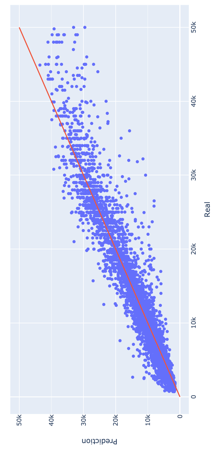
I have preprocessed the data and trained a regressor (random forest). Then i made a predicted v/s real values plot, to see the model behavior. Here, i noted that the regressor consistenly overestimates low values and underestimates high values: enter image description here

¿Is there any wat to fix this bias? I tried adding manually a bias to the predictions (by summing) and the metrics actually got better, but i don't think that is the correct way.

Thanks!

$\endgroup$
3
  • 2
    $\begingroup$ I’m voting to close this question because it needs to be in English. $\endgroup$
    – whuber
    Commented Dec 28, 2020 at 13:57
  • 1
    $\begingroup$ Interesting behavior. I think it may have something to do with the parameters you chose to fit the random forest. Mind sharing all of them (e.g. max tree size/min node size, # of trees, # regressors randomly chosen) as well as what the response and the regressors are (i.e. purpose of your prediction)? Also what package did you use (if R) and what is the code syntax? $\endgroup$
    – PaulG
    Commented Dec 29, 2020 at 15:05
  • $\begingroup$ @PaulG i want to value properties. I trained a 4 random forests: houses sell, appartments sell, houses rent and appartments rent. This particular chart is for houses at selI (but the behavior at the other models is the same), which i had the following tuned hyperparameters: n_estimators=102, max_features=4, max_depth=34. I am uising python and the typical data science libraries: pandas, numpy, scikit-learn, etc. (sorry for the bad english, im not native haha) $\endgroup$
    – Federico
    Commented Jan 8, 2021 at 18:57

3 Answers 3

1
$\begingroup$

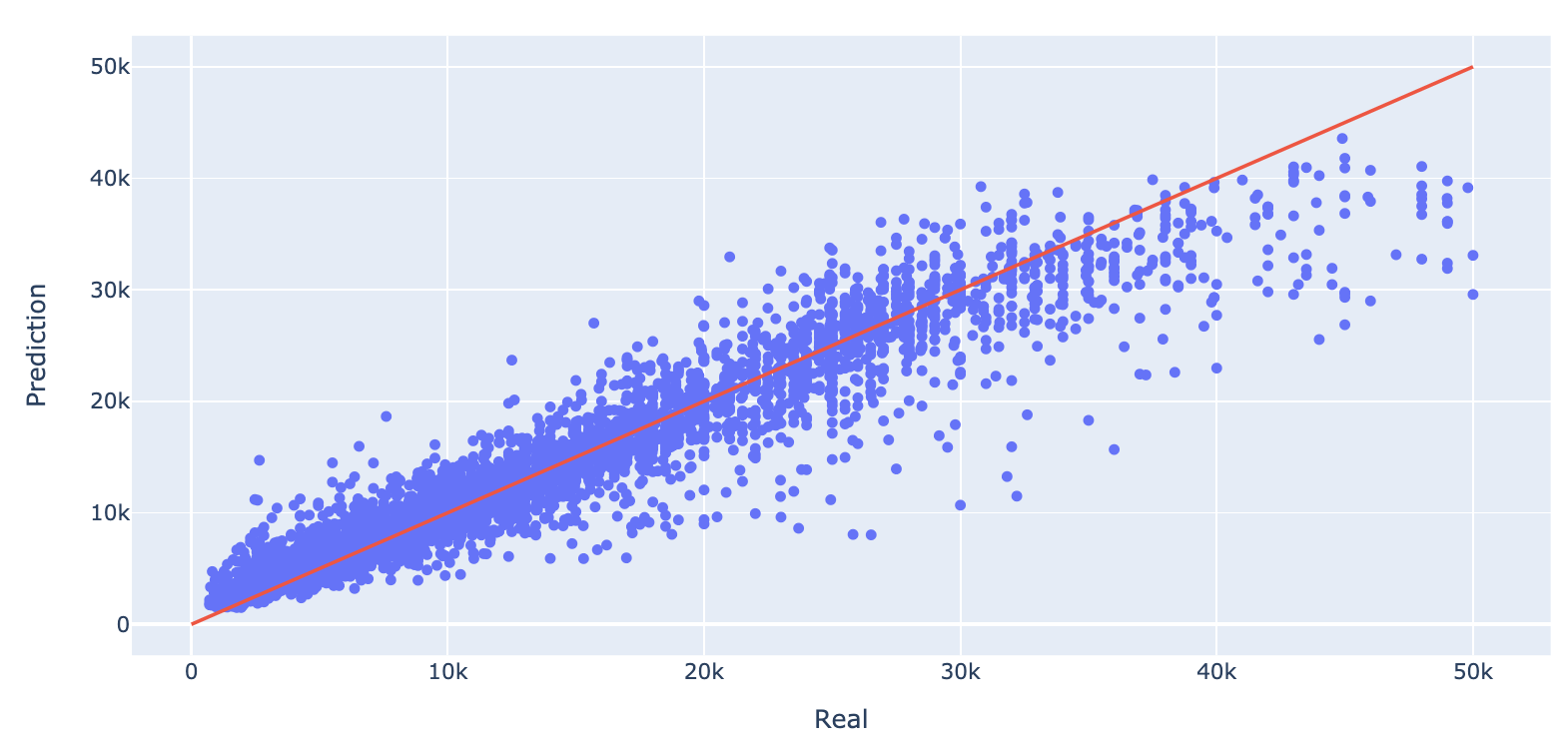
This curve looks less bad when you switch the axes.

axes switched

For each given predicted value (currently on the y-axis), you see more or less as many true values above and below (right and left on the x-axis).

So the model is not so much biased.


Related is this example of linear regression from this question/answer

example

You can fit X versus Y or Y versus X.

Due to regression dilution you get that the regression lines are a bit flat (less steep). The one curve represents E(X|Y) and the other curve represents E(Y|X). If you switch their roles then the curves will be biased for high/low values.

This switching of roles is what also happens in your image. Your curve gives an estimate of the expected true value conditional on the regressor. The true values (on the horizontal/x-axis) seem to be more or less evenly distributed around the predicted mean (you have to compare left/right for this and not up/down).

$\endgroup$
1
$\begingroup$

Your bias is really through a fairly narrow range. It is from 0-7K; and >32K. At >32K it looks like you have relatively few observations. So, those seem to all be outliers that may be difficult to fit.

I would pay more attention to the 0-7K range where you have a lot more observations. Maybe there is a simple way to add a predictor variable for the 0-7K range. This predictor could be structured as a simple constant or an interaction variable with some of the other predictors that would change the coefficient associated with that other predictor.

If the above works, and it probably should; you could then try something similar with the >32K range.

$\endgroup$
0
$\begingroup$

I would be interested to hear more information about what your inputs are, and what you mean by "added a bias by summing". If you really just added some simple term (without cheating by looking at actuals), and your metric improved, then there should be a way to improve the model, maybe by adding complexity.

However, the behavior you see might just be unavoidable due to natural noise in the output variable. Imagine you are predicting height from age and gender. Then there is going to be some natural variation in height above what can be described by those simple inputs. So all the super tall people are going to be underestimated, and all the super short people are going to be overestimated.

In other words, you can't correct for this because real value is not an input the model can see. Try plotting the residual error against each of your inputs on the x-axis one at a time. If you see similar weak points or biases in these plots, then there could be an opportunity to fix things.
$\endgroup$

Your Answer

By clicking “Post Your Answer”, you agree to our terms of service and acknowledge you have read our privacy policy.

Not the answer you're looking for? Browse other questions tagged or ask your own question.