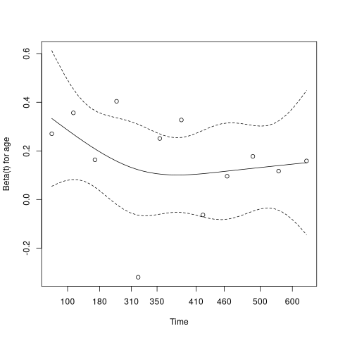
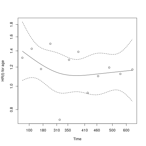
I posted a question on Stack Overflow. But the question got closed as the person who closed it wrote that it should belong here in Stack Exchange. I'm not sure why but here is the link for the post. I'm aware of the residual plot shows the result of the estimate of the regression coefficient for the covariate over time. But does it make sense to convert the y-axis by exp() to get the anti-log HR? Or should I consider to plot the HR over time instead of converting the y-axis from the residual plot? But either way, I still don't know how to visualise the HR over time in R.
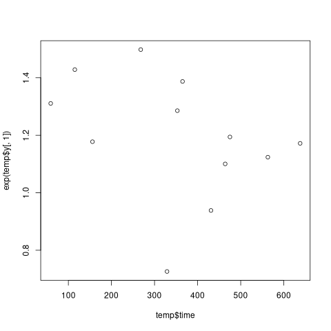
The problem I had when trying to exp() the y-axis is solved by the comment from Eonema. But the plot I get in R is not pretty at all.
The question from the previous post is as follows:
I have tried to visualise the proportional hazard (ph) assumption for my cox-ph model by plotting the smooth scaled schoenfeld residual plot. I'm working in R.
The residual plot is computed in R like this
test_ph <- cox.zph(my_cox_model, transform="identity")
plot(test_ph, resid=FALSE)
The output I get from the above code, is the y-axis representing the Beta(t) for the covariate over time (on the x-axis). However, I'm interested in having the y-axis showing the HR. I have tried to exp() the y values like in the following codes, and then plotting, but it did not work
hr <- exp(test_ph$y)
time <- test_ph$time #X-axis is names time in the test_ph
plot(time, hr)
How can I convert the values on the y-axis to HR for the residual plot? Is it even possible to do that, or should I code a plot for plotting the HR over time instead converting the y-axis on the residual plot? If so, I still need help to code the latter in R as well.
Thanks in advance!


