One way to show how a function varies as you change two parameters is using a trellis chart (also known as "lattice", "grid", "panel" or by Tufte's term, "small multiples"). The rows and columns show the possible values of the two parameters, and the grid allows you to see how their effects on your distribution interact.
The graph below is one such example, best viewed at full-size, that I posted with R code (using facet_grid in ggplot2, see documentation) in an answer to a question about the distribution of the sample $R^2$ for a multiple regression when the population slope coefficients are all zero. In this situation, a linear model was being fitted to normally distributed data with constant mean (so that if $R^2$ had been calculated for the whole population it would be zero) and the sample $R^2$ has a distribution whose density function depends on $k$, the number of fitted parameters in the regression model (varying across the columns) and $n$, the sample size (varying across the rows).
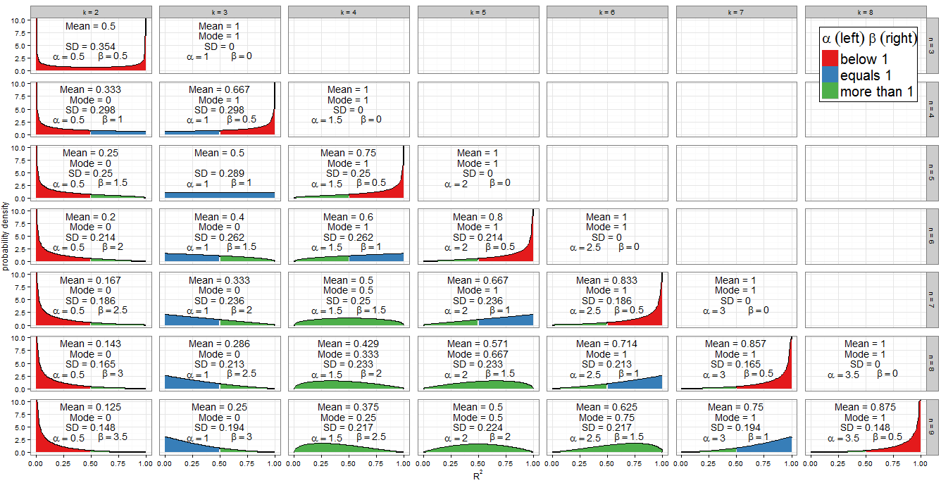
Note that this was a univariate distribution, so that for any given $n$ and $k$, the probability density (on the vertical axis) was a function of $R^2$ alone (on the horizontal axis). What if we have a function of more than one variable? This means that a solution in ggplot2 is no longer viable, since that package can only handle two-dimensional plots. Other R packages allow you to plot 3D charts with multiple facets, though.
For what the results might look like, there is an example in the (open access) article: Azmeri Khan and Glen D. Rayner, "Robustness to non-normality of common tests for the many-sample location problem," Journal of Applied Mathematics and Decision Sciences, vol. 7, no. 4, pp. 187-206, 2003. doi:10.1155/S1173912603000178
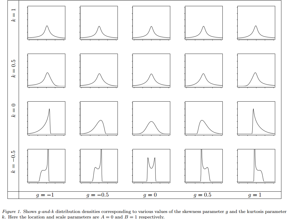
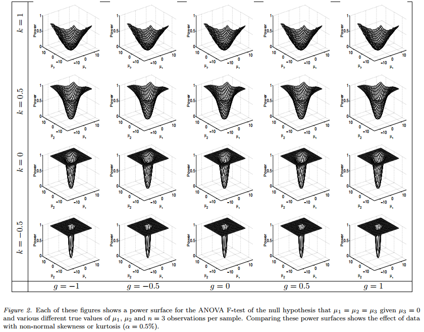
In Figure 1 they show how the g-and-k distribution varies for various values of the skewness parameter $g$ and the kurtosis parameter $k$, in a similar way to my plot above. But in Figure 2 they illustrate various different power surfaces for an ANOVA test applied to non-normal data drawn from a g-and-k distribution: the power surfaces are faceted by the $g$ and $k$ values illustrated in Figure 1. So the underlying distributions shown in Figure 1, produce a power surface in the corresponding facet of Figure 2. The power surfaces are 3D plots because they show how power varies across changes to the group means $\mu_1$ and $\mu_2$. The graphs make more sense in the context of the original paper, which is quite straightforward to read, but if you want to understand the visualization I will include both figures in my answer (the authors released the article under a Creative Commons Attribution license).
It seems that the function you want to plot actually depends on three variables (which you have listed as var1, var2 and var3) and you want to see how that function changes as you vary a and b. This is a harder challenge; for each facet you need to consider how to visualize 4-dimensional data.
In fact Khan and Rayner had a similar issue, as they wanted to show how the power curves varied with sample size as well as with $g$ and $k$. The way they achieved this was to use the same sample size for each trellis chart, but then produce different charts to show the effect of changing sample sizes. Figure 2 had $n=3$, Figure 3 had $n=5$ and Figure 4 had $n=15$. This effectively let them panel a function of two variables (power as a function of $\mu_1$ and $\mu_2$) by three other variables ($g$, $k$ and $n$). Your issue is subtly different as you have a function of three variables which you would ideally like to panel by $a$ and $b$, but adopting a variant of their approach is one option available to you.
As a separate issue: you seem to be trying to plot a multivariate cumuluative distribution function. I wonder whether you'd find it more informative to plot the probability density instead.


aandbessentially correspond to distribution parameters, whilevar1tovar3are the variables whose distribution is being modelled. $\endgroup$