120
$\begingroup$

Suppose I want to see whether my data is exponential based on a histogram (i.e. skewed to the right).

Depending on how I group or bin the data, I can get wildly different histograms.

One set of histograms will make is seem that the data is exponential. Another set will make it seem that data are not exponential. How do I make determining distributions from histograms well defined?

$\endgroup$
1
  • 24
    $\begingroup$ Why not forget about the histograms, because the problems you describe are well established, and consider alternative tools such as qq plots and goodness of fit tests? $\endgroup$
    – whuber
    Commented Mar 8, 2013 at 18:28

4 Answers 4

182
$\begingroup$

The difficulty with using histograms to infer shape

While histograms are often handy and mostly useful, they can be misleading. Their appearance can alter quite a lot with changes in the locations of the bin boundaries.

This problem has long been known*, though perhaps not as widely as it should be -- you rarely see it mentioned in elementary-level discussions (though there are exceptions).

* for example, Paul Rubin[1] put it this way: "it's well known that changing the endpoints in a histogram can significantly alter its appearance". .

I think it's an issue that should be more widely discussed when introducing histograms. I'll give some examples and discussion.

Why you should be wary of relying on a single histogram of a data set

Take a look at these four histograms:
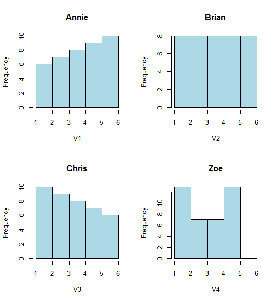
Four histograms

That's four very different looking histograms.

If you paste the following data in (I'm using R here):

Annie <- c(3.15,5.46,3.28,4.2,1.98,2.28,3.12,4.1,3.42,3.91,2.06,5.53,
5.19,2.39,1.88,3.43,5.51,2.54,3.64,4.33,4.85,5.56,1.89,4.84,5.74,3.22,
5.52,1.84,4.31,2.01,4.01,5.31,2.56,5.11,2.58,4.43,4.96,1.9,5.6,1.92)
Brian <- c(2.9, 5.21, 3.03, 3.95, 1.73, 2.03, 2.87, 3.85, 3.17, 3.66, 
1.81, 5.28, 4.94, 2.14, 1.63, 3.18, 5.26, 2.29, 3.39, 4.08, 4.6, 
5.31, 1.64, 4.59, 5.49, 2.97, 5.27, 1.59, 4.06, 1.76, 3.76, 5.06, 
2.31, 4.86, 2.33, 4.18, 4.71, 1.65, 5.35, 1.67)
Chris <- c(2.65, 4.96, 2.78, 3.7, 1.48, 1.78, 2.62, 3.6, 2.92, 3.41, 1.56, 
5.03, 4.69, 1.89, 1.38, 2.93, 5.01, 2.04, 3.14, 3.83, 4.35, 5.06, 
1.39, 4.34, 5.24, 2.72, 5.02, 1.34, 3.81, 1.51, 3.51, 4.81, 2.06, 
4.61, 2.08, 3.93, 4.46, 1.4, 5.1, 1.42)
Zoe <- c(2.4, 4.71, 2.53, 3.45, 1.23, 1.53, 2.37, 3.35, 2.67, 3.16, 
1.31, 4.78, 4.44, 1.64, 1.13, 2.68, 4.76, 1.79, 2.89, 3.58, 4.1, 
4.81, 1.14, 4.09, 4.99, 2.47, 4.77, 1.09, 3.56, 1.26, 3.26, 4.56, 
1.81, 4.36, 1.83, 3.68, 4.21, 1.15, 4.85, 1.17)

Then you can generate them yourself:

opar<-par()
par(mfrow=c(2,2))
hist(Annie,breaks=1:6,main="Annie",xlab="V1",col="lightblue")
hist(Brian,breaks=1:6,main="Brian",xlab="V2",col="lightblue")
hist(Chris,breaks=1:6,main="Chris",xlab="V3",col="lightblue")
hist(Zoe,breaks=1:6,main="Zoe",xlab="V4",col="lightblue")
par(opar)

Now look at this strip chart:

x<-c(Annie,Brian,Chris,Zoe)
g<-rep(c('A','B','C','Z'),each=40)
stripchart(x~g,pch='|')
abline(v=(5:23)/4,col=8,lty=3)
abline(v=(2:5),col=6,lty=3)
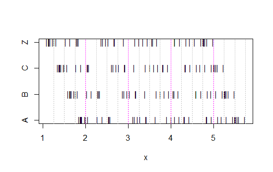
4 strip charts

(If it's still not obvious, see what happens when you subtract Annie's data from each set: head(matrix(x-Annie,nrow=40)))

The data has simply been shifted left each time by 0.25.

Yet the impressions we get from the histograms - right skew, uniform, left skew and bimodal - were utterly different. Our impression was entirely governed by the location of the first bin-origin relative to the minimum.

So not just 'exponential' vs 'not-really-exponential' but 'right skew' vs 'left skew' or 'bimodal' vs 'uniform' just by moving where your bins start.


Edit: If you vary the binwidth, you can get stuff like this happen:
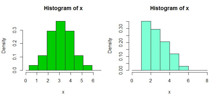
Skew vs bell

That's the same 34 observations in both cases, just different breakpoints, one with binwidth $1$ and the other with binwidth $0.8$.

x <- c(1.03, 1.24, 1.47, 1.52, 1.92, 1.93, 1.94, 1.95, 1.96, 1.97, 1.98, 
  1.99, 2.72, 2.75, 2.78, 2.81, 2.84, 2.87, 2.9, 2.93, 2.96, 2.99, 3.6, 
  3.64, 3.66, 3.72, 3.77, 3.88, 3.91, 4.14, 4.54, 4.77, 4.81, 5.62)
hist(x,breaks=seq(0.3,6.7,by=0.8),xlim=c(0,6.7),col="green3",freq=FALSE)
hist(x,breaks=0:8,col="aquamarine",freq=FALSE)

Nifty, eh?

Yes, those data were deliberately generated to do that... but the lesson is clear - what you think you see in a histogram may not be a particularly accurate impression of the data.

What can we do?

Histograms are widely used, frequently convenient to obtain and sometimes expected. What can we do to avoid or mitigate such problems?

As Nick Cox points out in a comment to a related question: The rule of thumb always should be that details robust to variations in bin width and bin origin are likely to be genuine; details fragile to such are likely to be spurious or trivial.

At the least, you should always do histograms at several different binwidths or bin-origins, or preferably both.

Alternatively, check a kernel density estimate at not-too-wide a bandwidth.

One other approach that reduces the arbitrariness of histograms is averaged shifted histograms,
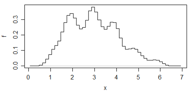
Averaged shifted histogram

(that's one on that most recent set of data) but if you go to that effort, I think you might as well use a kernel density estimate.

If I am doing a histogram (I use them in spite of being acutely aware of the issue), I almost always prefer to use considerably more bins than typical program defaults tend to give and very often I like to do several histograms with varying bin width (and, occasionally, origin). If they're reasonably consistent in impression, you're not likely to have this problem, and if they're not consistent, you know to look more carefully, perhaps try a kernel density estimate, an empirical CDF, a Q-Q plot or something similar.

While histograms may sometimes be misleading, boxplots are even more prone to such problems; with a boxplot you don't even have the ability to say "use more bins". See the four very different data sets in this post, all with identical, symmetric boxplots, even though one of the data sets is quite skew.

[1]: Rubin, Paul (2014) "Histogram Abuse!",
Blog post, OR in an OB world, Jan 23 2014
link ... (alternate link)

$\endgroup$
3
  • 1
    $\begingroup$ Practically every graph of necessity bins data like this. The bins are just small enough (the width of one pixel along the axis) that it doesn't matter? $\endgroup$ Commented Jul 11, 2013 at 19:13
  • 3
    $\begingroup$ @AJMansfield This is a bit like saying "every distribution is discrete" - while literally true, it obscures the relevant issue. A typical number of bins in a binned estimator is vastly smaller than a typical number of pixels... and with any graphics that make use of anti-aliasing, the 'effective' number of pixels is larger (in that it's potentially possible to distinguish differences of positions between pixels) $\endgroup$
    – Glen_b
    Commented Jul 12, 2013 at 0:45
  • 3
    $\begingroup$ The fundamental issue is that histograms heavily rely on the bin size. It is difficult to determine this a priori. $\endgroup$
    – user46925
    Commented Mar 20, 2016 at 14:51
29
$\begingroup$

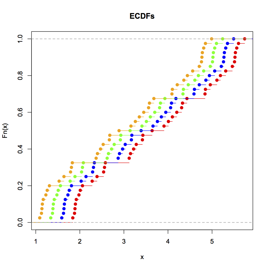
Cumulative distribution plots [MATLAB, R] – where you plot the fraction of data values less than or equal to a range of values – are by far the best way to look at distributions of empirical data. Here, for example, are the ECDFs of this data, produced in R:

Alice, Brian, Chris and Zoe's ECDF plots

This can be generated with the following R input (with the above data):

plot(ecdf(Annie),xlim=c(min(Zoe),max(Annie)),col="red",main="ECDFs")
lines(ecdf(Brian),col="blue")
lines(ecdf(Chris),col="green")
lines(ecdf(Zoe),col="orange")

As you can see, it's visually obvious that these four distributions are simply translations of each other. In general, the benefits of ECDFs for visualizing empirical distributions of data are:

  1. They simply present the data as it actually occurs with no transformation other than accumulation, so there's no possibility of accidentally deceiving yourself, as there is with histograms and kernel density estimates, because of how you're processing the data.
  2. They give a clear visual sense of the distribution of the data since each point is buffered by all the data before and after it. Compare this with non-cumulative density visualizations, where the accuracy of each density is naturally unbuffered, and thus must be estimated either by binning (histograms) or smoothing (KDEs).
  3. They work equally well regardless of whether the data follows a nice parametric distribution, some mixture, or a messy non-parametric distribution.

The only trick is learning how to read ECDFs properly: shallow sloped areas mean sparse distribution, steep sloped areas mean dense distribution. Once you get the hang of reading them, however, they're a wonderful tool for looking at distributions of empirical data.

$\endgroup$
1
  • 1
    $\begingroup$ Is there any documentation available to read CDFs? eg what if my cdf distribution like you have showed above then how can we classify \ guesstimate it into chisquare, normal or other distribution based on looks $\endgroup$
    – stats101
    Commented Aug 12, 2016 at 15:22
29
$\begingroup$

A kernel density or logspline plot may be a better option compared to a histogram. There are still some options that can be set with these methods, but they are less fickle than histograms. There are qqplots as well. A nice tool for seeing if data is close enough to a theoretical distribution is detailed in:

 Buja, A., Cook, D. Hofmann, H., Lawrence, M. Lee, E.-K., Swayne,
 D.F and Wickham, H. (2009) Statistical Inference for exploratory
 data analysis and model diagnostics Phil. Trans. R. Soc. A 2009
 367, 4361-4383 doi: 10.1098/rsta.2009.0120

The short version of the idea (still read the paper for details) is that you generate data from the null distribution and create several plots one of which is the original/real data and the rest are simulated from the theoretical distribution. You then present the plots to someone (possibly yourself) that has not seen the original data and see if they can pick out the real data. If they cannot identify the real data then you don't have evidence against the null.

The vis.test function in the TeachingDemos package for R help implement a form of this test.

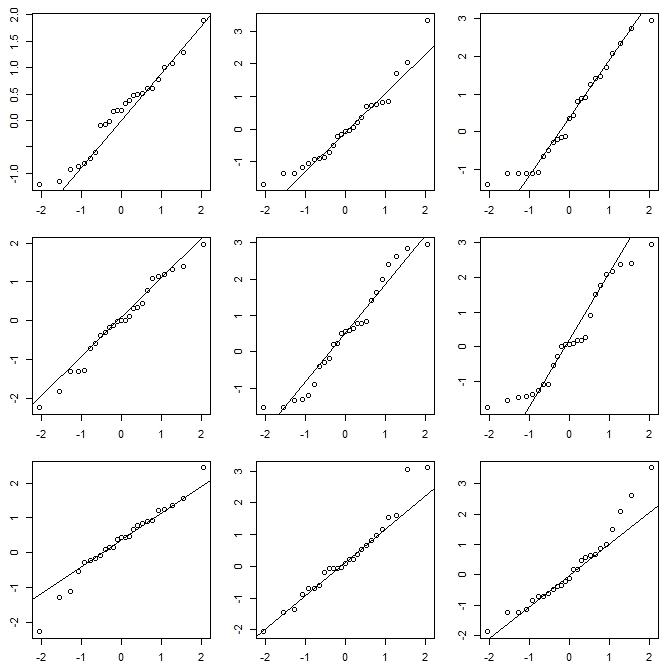
Here is a quick example. One of the plots below is 25 points generated from a t distribution with 10 degrees of freedom, the other 8 are generated from a normal distribution with the same mean and variance.

enter image description here

The vis.test function created this plot and then prompts the user to choose which of the plots they think is different, then repeats the process 2 more times (3 total).

$\endgroup$
1
  • $\begingroup$ @ScottStafford, I added a copy of the plot above. This one uses qqplots but the function will also generate histograms or density plots could be programmed. $\endgroup$
    – Greg Snow
    Commented Apr 18, 2013 at 19:13
2
$\begingroup$

Suggestion: Histograms usually only assign the x-axis data to have occurred at the midpoint of the bin and omit x-axis measures of location of greater accuracy. The effect this has on the derivatives of fit can be quite large. Let us take a trivial example. Suppose we take the classical derivation of a Dirac delta but modify it so that we start with a Cauchy distribution at some arbitrary median location with a finite scale (full width half-maximum). Then we take the limit as the scale goes to zero. If we use the classical definition of a histogram and do not change bin sizes we will capture neither the location or the scale. If however, we use a median location within bins of even of fixed width, we will always capture the location, if not the scale when the scale is small relative to the bin width.

For fitting values where the data is skewed, using fixed bin midpoints will x-axis shift the entire curve segment in that region, which I believe relates to the question above.

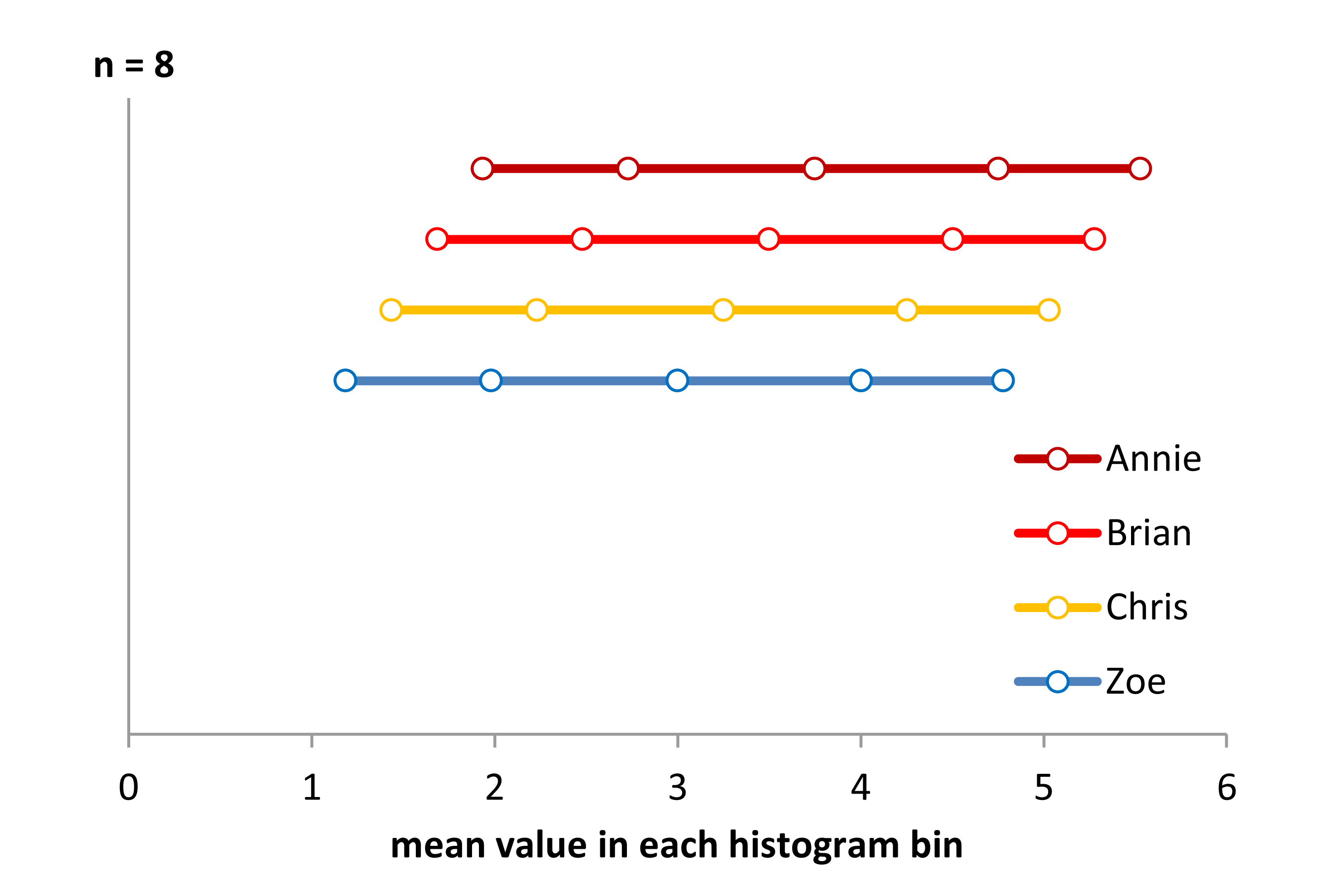
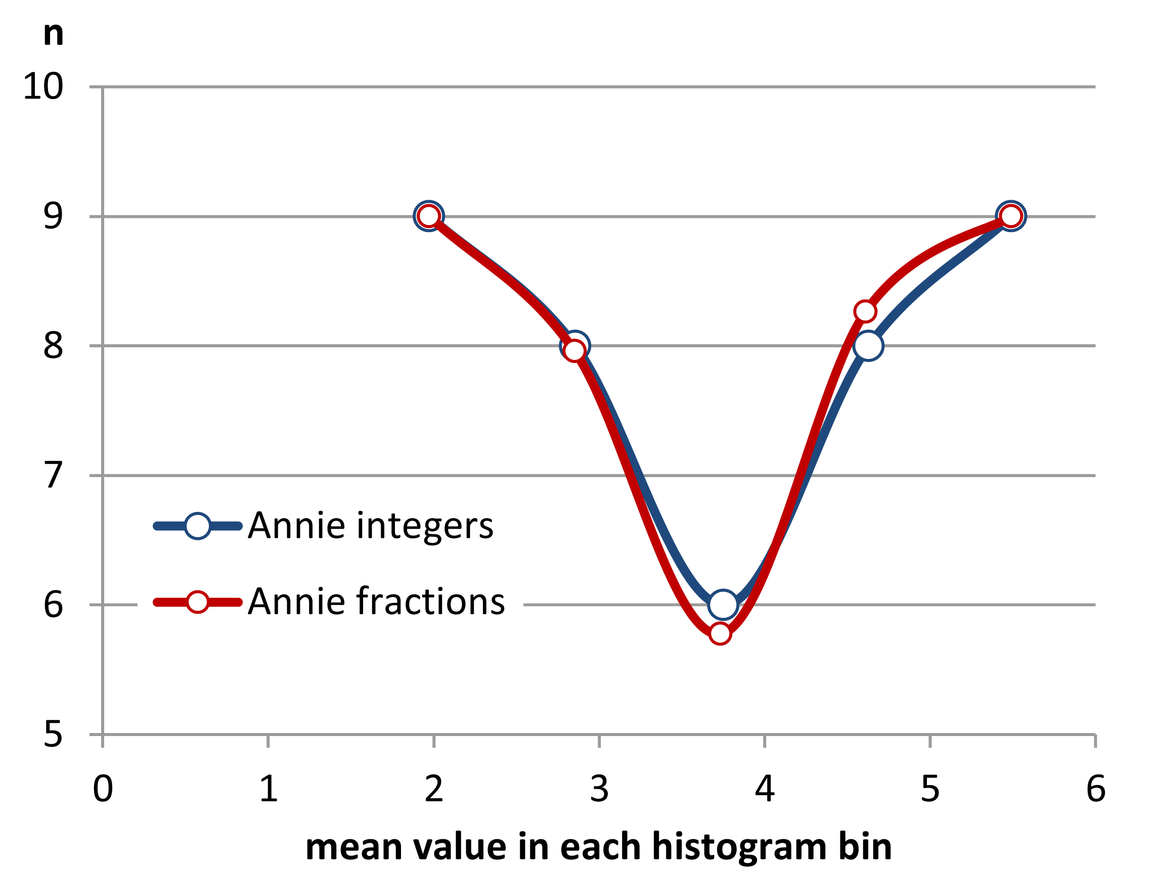
STEP 1 funny histo Here is an almost solution. I used $n=8$ in each histogram category, and just displayed these as the mean x-axis value from each bin. Since each histogram bin has a value of 8, the distributions all look uniform, and I had to offset them vertically to show them. The display is not the correct answer, but it is not without information. It correctly tells us that there is an x-axis offset between groups. It also tells us that the actual distribution appears to be slightly U shaped. Why? Note that the distance between mean values is further apart in the centers, and closer at the edges. So, to make this a better representation, we should borrow whole samples and fractional amounts of each bin boundary sample to make all the mean bin values on the x-axis equidistant. Fixing this and displaying it properly would require a bit of programming. But, it may just be a way to make histograms so that they actually display the underlying data in some logical format. The shape will still change if we change the total number of bins covering the range of the data, but the idea is to resolve some of the problems created by binning arbitrarily.

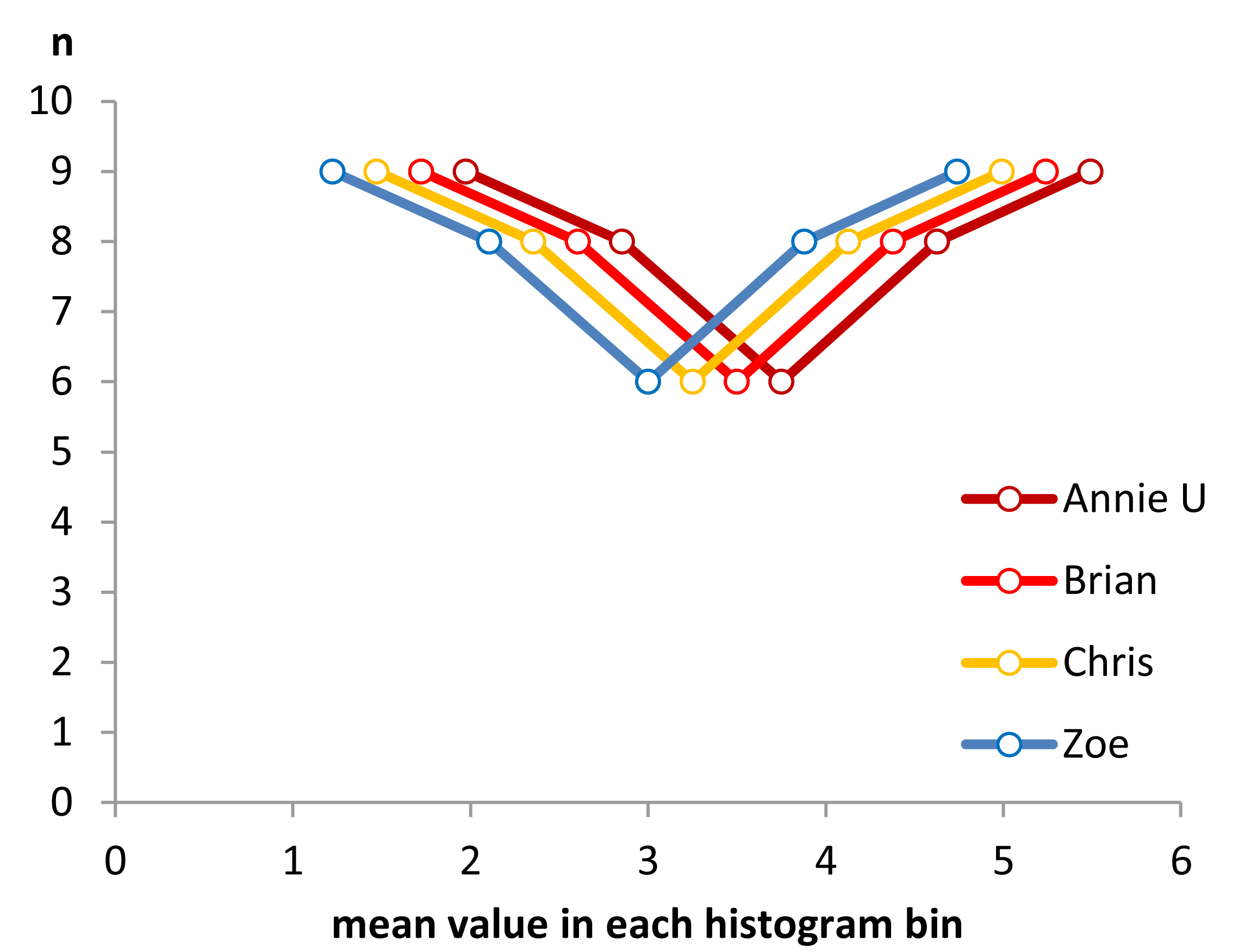
STEP 2 So let's start borrowing between bins to try to make the means more evenly spaced.enter image description here

Now, we can see the shape of the histograms beginning to emerge. But the difference between means is not perfect as we only have whole numbers of samples to swap between bins. To remove the restriction of integer values on the y-axis and complete the process of making equidistant x-axis mean values, we have to start sharing fractions of a sample between bins.

Step 3 The sharing of values and parts of values. histo3

As one can see, the sharing of parts of a value at a bin boundry can improve the uniformity of distance between mean values. I managed to do this to three decimal places with the data given. However, one cannot, I do not think, make the distance between mean values exactly equal in general, as the coarseness of the data will not permit that.

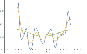
One can, however, do other things like use kernel density estimation.

Here we see Annie's data as a bounded kernel density using Gaussian smoothings of 0.1, 0.2, and 0.4. The other subjects will have shifted functions of the same type, provided one does the same thing as I did, namely use the lower and upper bounds of each data set. So, this is no longer a histogram, but a PDF, and it serves the same role as a histogram without some of the warts.

kernelsmooth

$\endgroup$

Your Answer

By clicking “Post Your Answer”, you agree to our terms of service and acknowledge you have read our privacy policy.

Not the answer you're looking for? Browse other questions tagged or ask your own question.