31
$\begingroup$

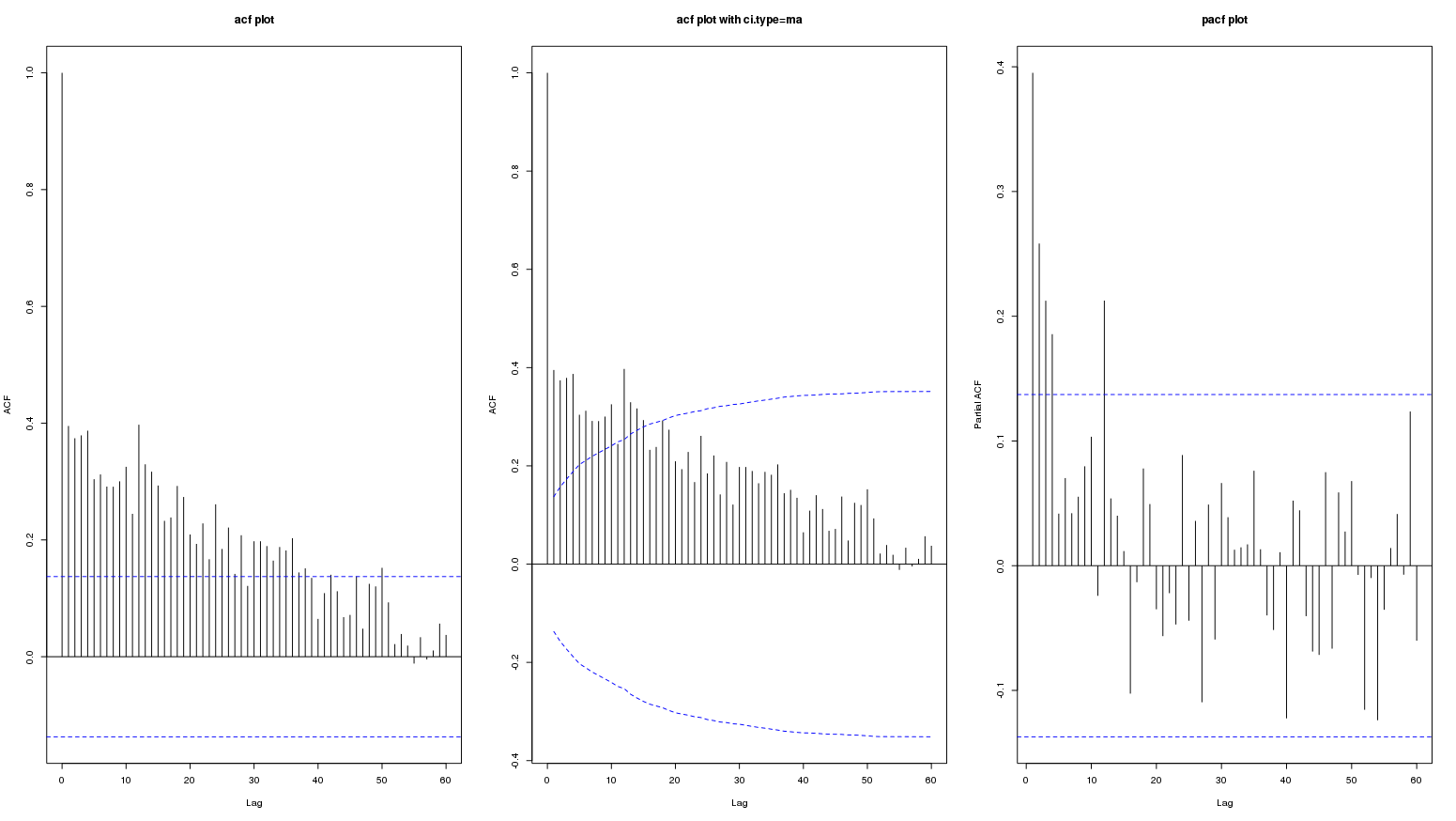
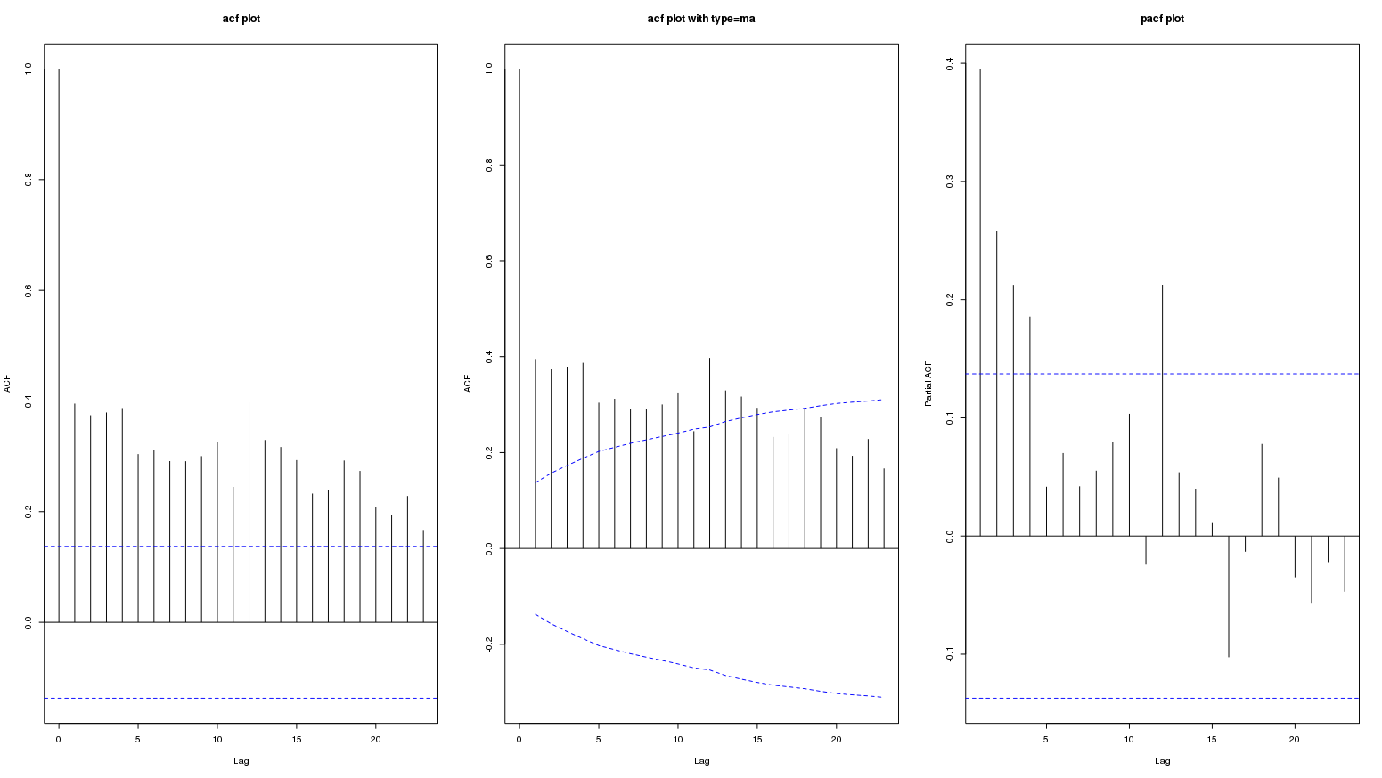
Following are acf and pacf plots of a monthly data series. The second plot is acf with ci.type='ma':

enter image description here

The persistence of high values in acf plot probably represent a long term positive trend. The question is if this represent seasonal variation?

I tried to see different sites on this topic but I am not sure if these plots show seasonality.

ACF and PACF plot analysis

Help interpreting ACF- and PACF-plots

Help understanding the following picture of ACF

Autocorrelation and partial autocorrelation interpretation

Edit: following is the graph for lag upto 60:

enter image description here

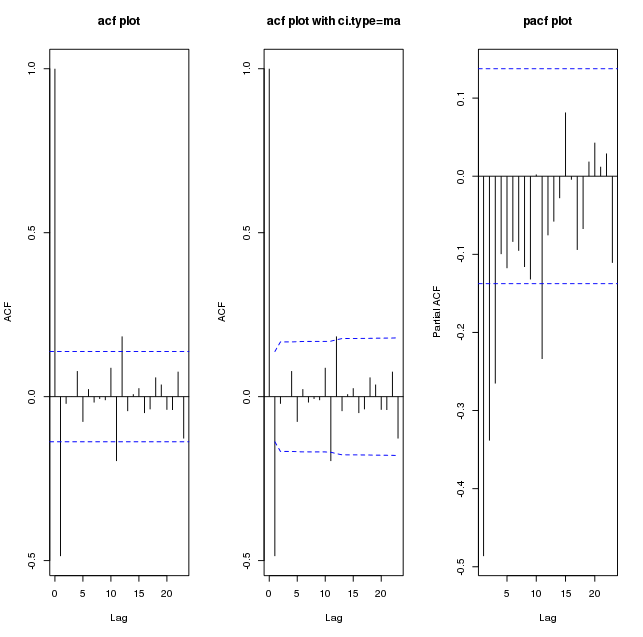
Following are plots of diff(my_series):

enter image description here

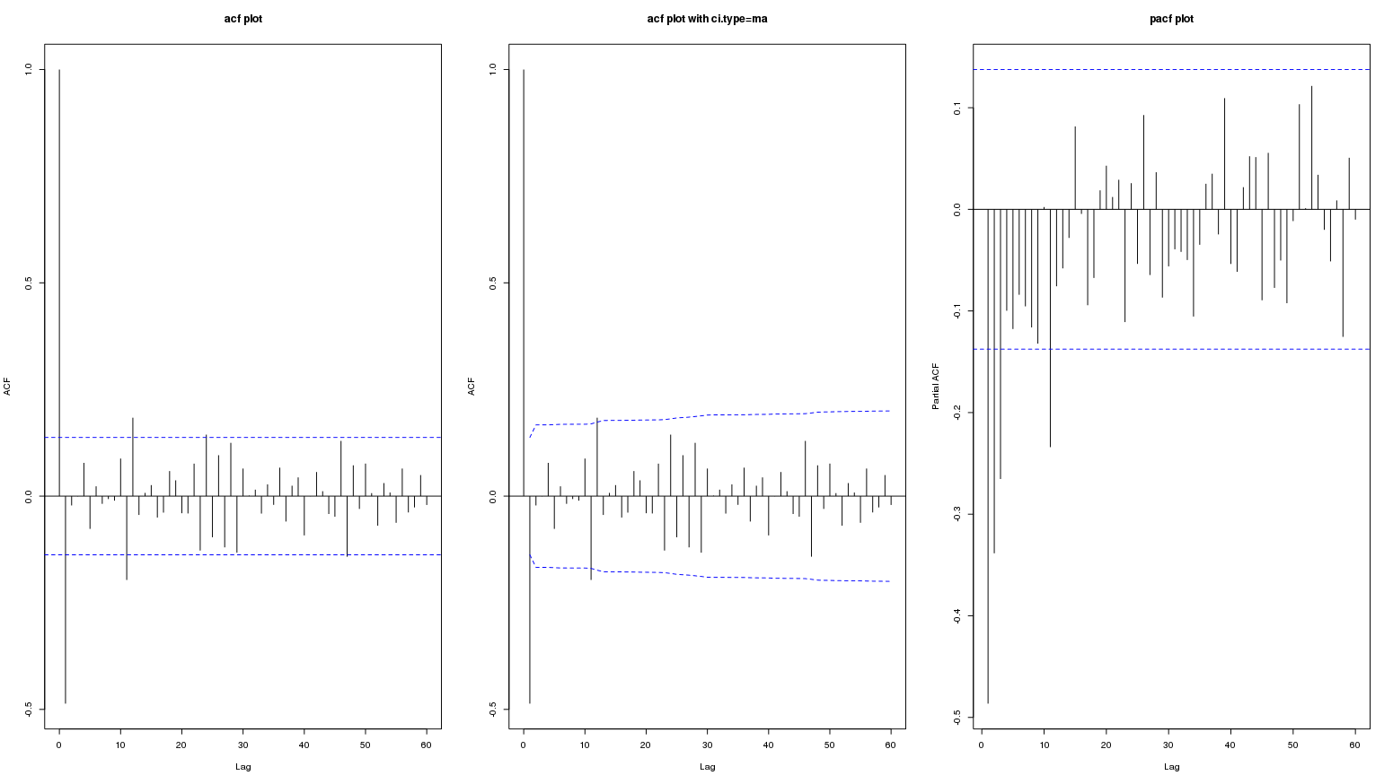
And upto lag 60:

enter image description here

Edit: This data is from: Is this an appropriate method to test for seasonal effects in suicide count data? Here the contributors did not consider acf and pacf plot of original or differenced series worth mentioning (so it must not be important). Only acf/pacf plots of residuals was referred to in a couple of places.

$\endgroup$
5
  • 1
    $\begingroup$ Can you add something about your data (eg, a basic plot)? Did you try anything like stl()? $\endgroup$ Commented Apr 18, 2015 at 17:01
  • $\begingroup$ I am trying to understand how to determine seasonality from acf and pacf plots. Is review of basic plot or stl necessary for this? Can we not determine something from these plots? $\endgroup$
    – rnso
    Commented Apr 18, 2015 at 17:09
  • 1
    $\begingroup$ That would be fine. For clarity, your question isn't really about what is going on w/ your data, but is about what can be understood from these plots in isolation, is that right? $\endgroup$ Commented Apr 18, 2015 at 17:11
  • 1
    $\begingroup$ Yes. I often need to determine if seasonality is present in my data so I want to understand what information can I derive from acf and pacf plots. The plots of stl function is reasonably easy to understand but not these plots. $\endgroup$
    – rnso
    Commented Apr 18, 2015 at 17:18
  • $\begingroup$ Your data does indeed have some seasonality. Please see my response to @javlacalle . $\endgroup$
    – IrishStat
    Commented Apr 20, 2015 at 15:36

2 Answers 2

13
$\begingroup$

looking at plots in order to try to pigeonhole the data into a guessed arima model works well when 1: There are no outliers/pulses/level shifts, local time trends and no seasonal deterministic pulses in the data AND 2) when the arima model has constant parameters over time AND 3) when the error variance from the arima model has constant variance over time. When do these three things hold .... in most textbook data sets presenting the ease of arima modelling. When do 1 or more of the 3 not hold .... in every real world data set that I have ever seen . The simple answer to your question requires access to the original facts ( the historical data ) not the secondary descriptive information in your plots. But this is just my opinion!

EDITED AFTER RECEIPT OF DATA:

I was on a Greek vacation (actually doing something other than time series analysis) and was unable to analyse the SUICIDE DATA but in conjunction with this post. It is now fitting and right that I submit an analysis to follow up/prove by example my comments about multi-stage model identification strategies and the failings of simple visual analysis of simple correlation plots as "the proof is in the pudding".

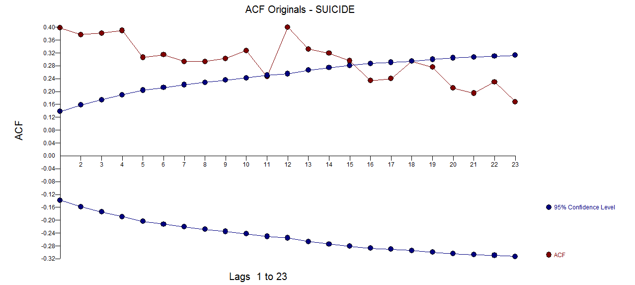
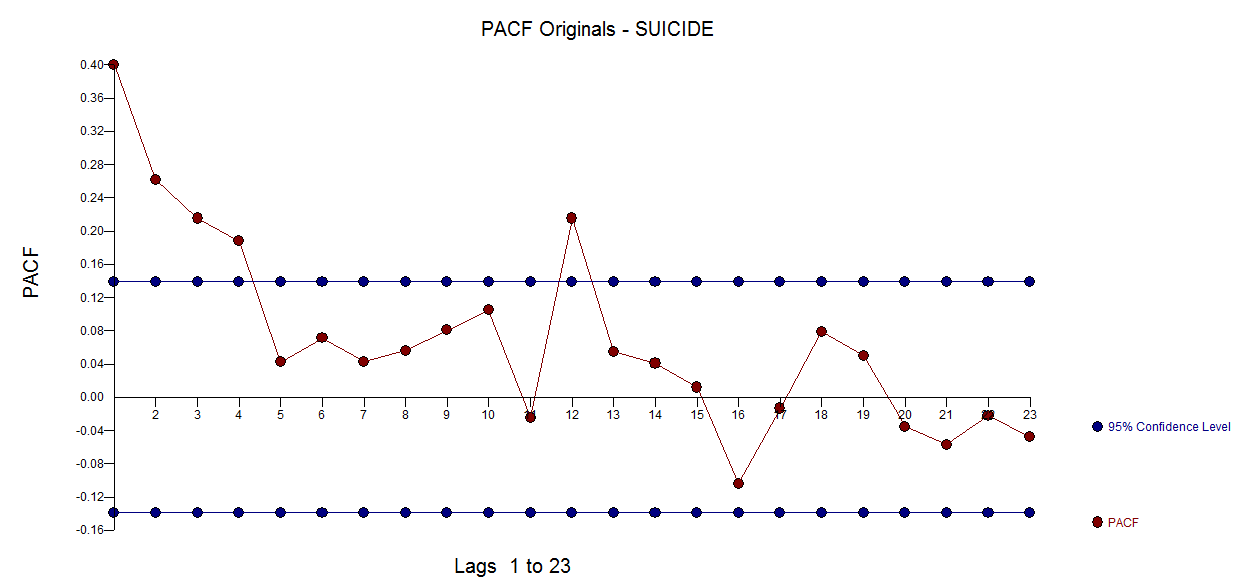
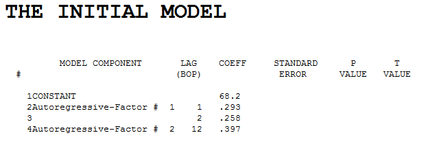
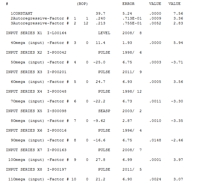
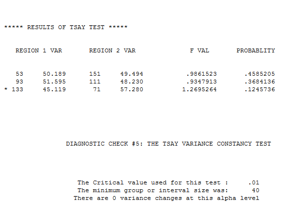
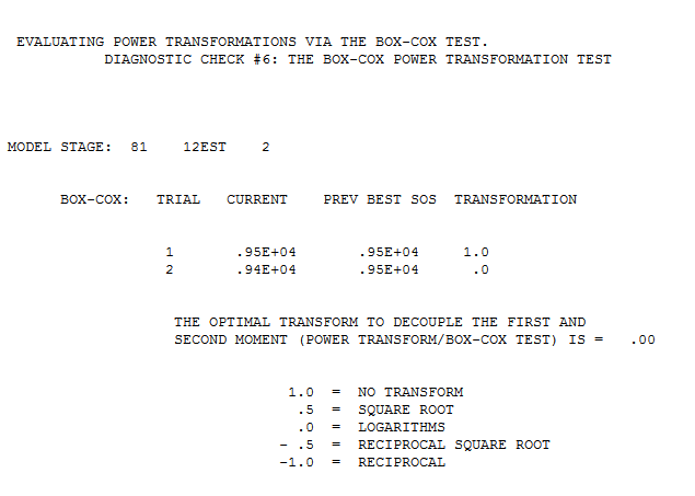
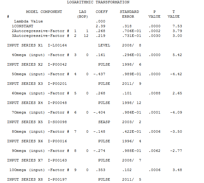
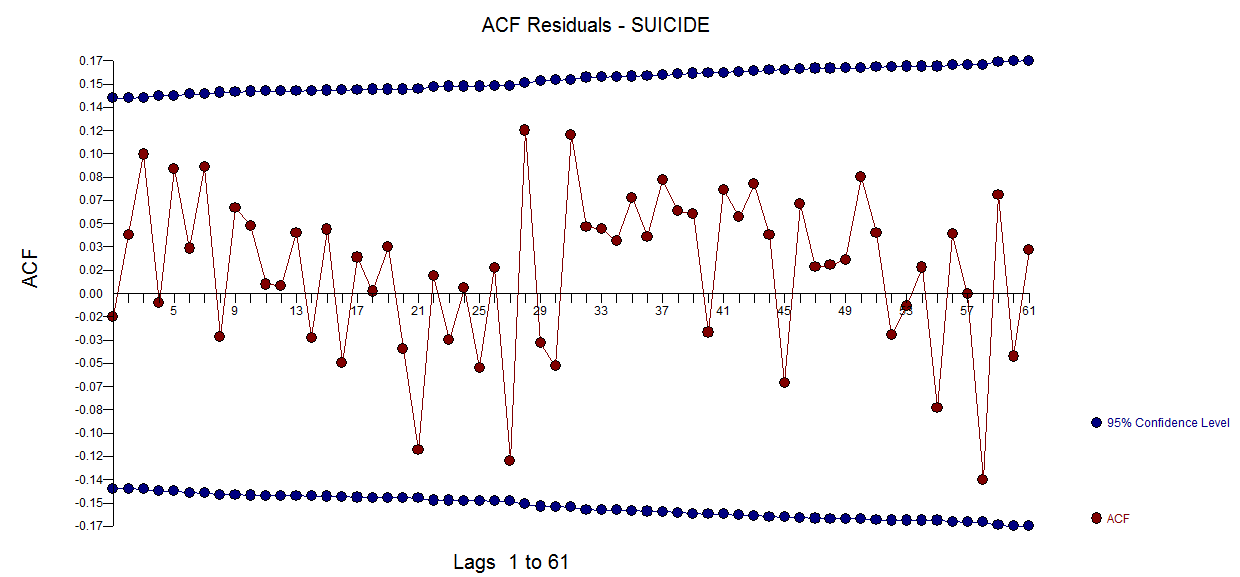
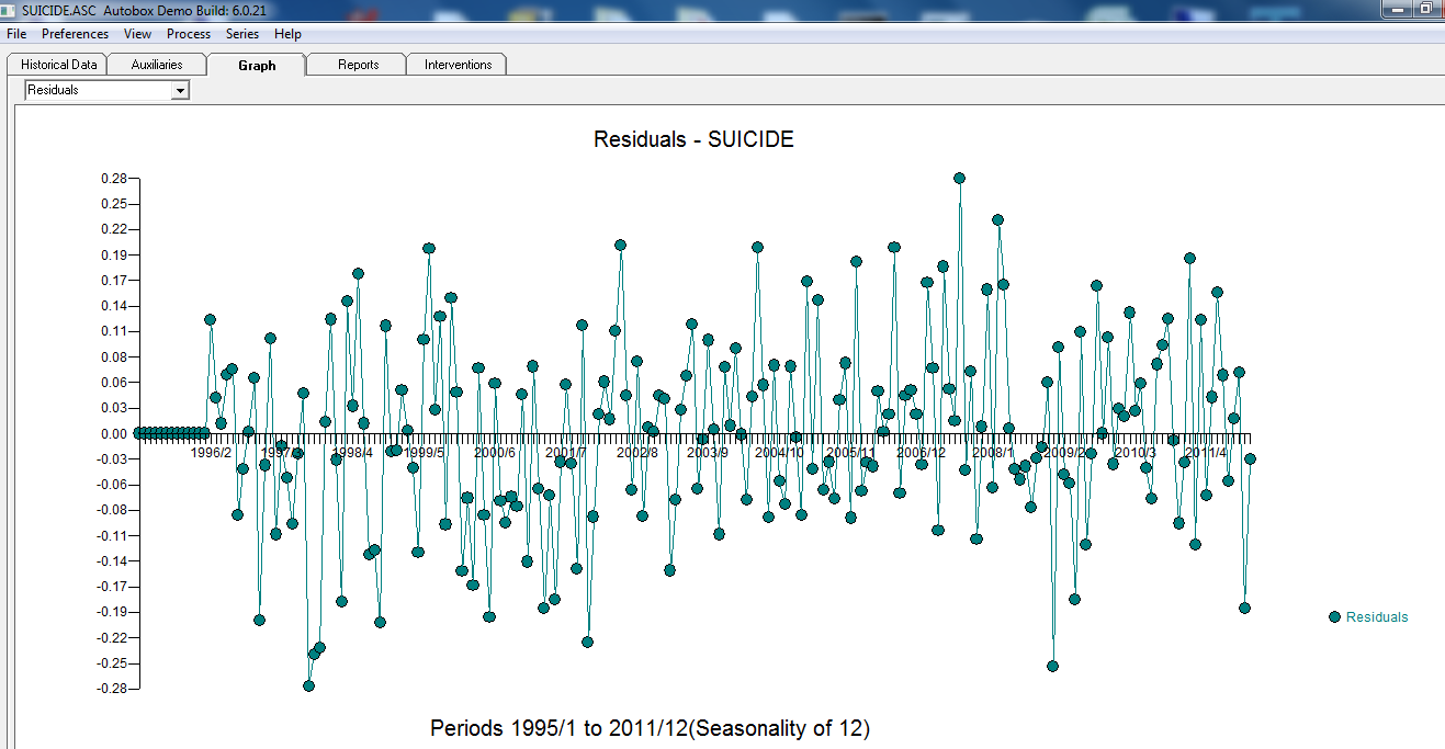
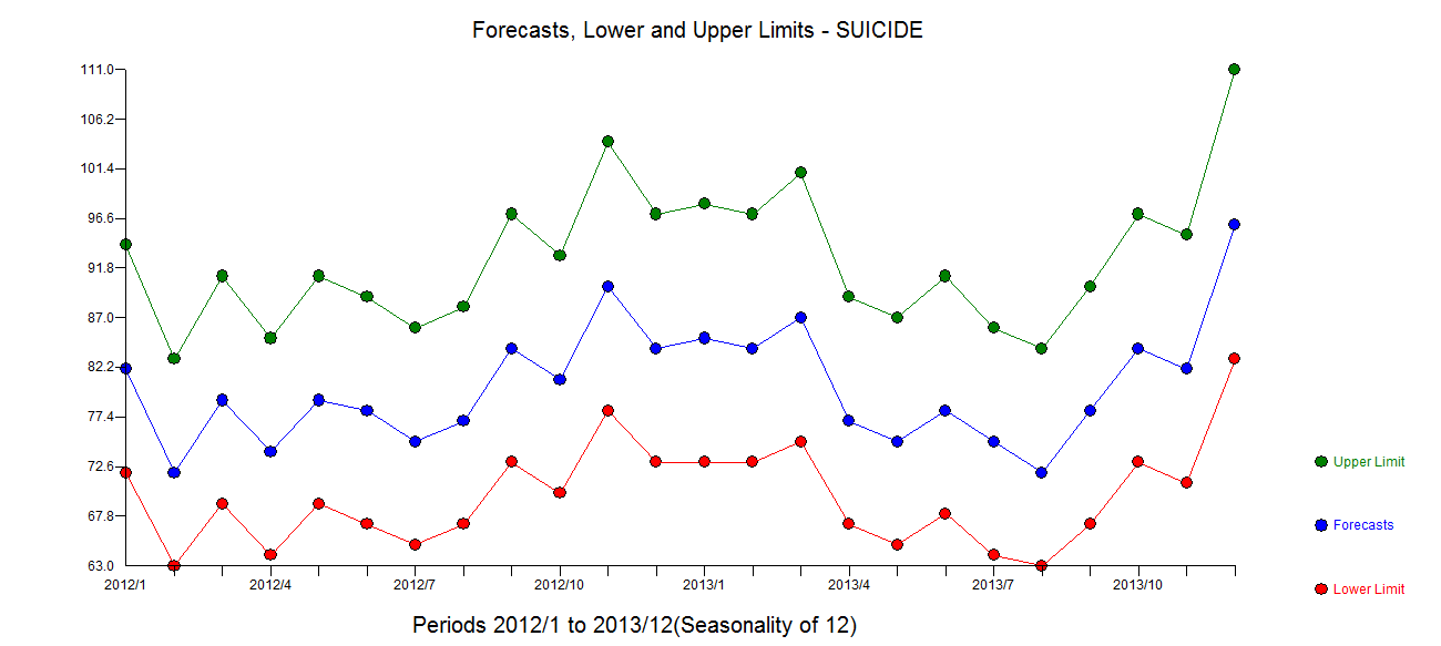
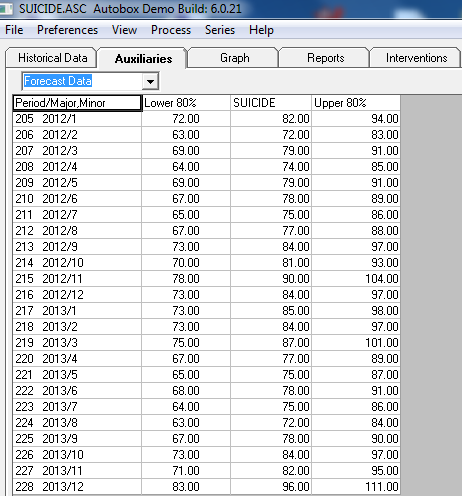
Here is the ACF of the original data enter image description here The PACF of the original series enter image description here . AUTOBOX http://www.autobox.com/cms/ a piece of software that I have helped developed uses heuristics to identify a starting model In this case the initially identified model was found to be enter image description here . Diagnostic checking of the residuals from this model suggested some model augmentation using a level shift, pulses and a seasonal pulse Note that the Level Shift is detected at or about period 164 which is nearly identical to an earlier conclusion about period 176 from @forecaster. All roads do not lead to Rome but some can get you close ! enter image description here . Testing for parameter constancy rejected parameter changes over time . Checking for deterministic changes in the error variance concluded that no deterministic changes were detected in the error variance.enter image description here . The Box-Cox test for the need for a power transform was positive with the conclusion that a logarithmic transform was necessary.enter image description here . The final model is here enter image description here . The residuals from the final model appear to be free of any autocorrelation enter image description here . The plot of the final models residuals appears to be free of any Gaussian Violations enter image description here . The plot of Actual/Fit/Forecasts is here enter image description here with forecasts here enter image description here

$\endgroup$
6
  • $\begingroup$ Thanks for your answer. Are these assumptions so important and always so flouted in real world data that acf and pacf plots can almost never be interpreted in isolation? $\endgroup$
    – rnso
    Commented Apr 19, 2015 at 2:06
  • $\begingroup$ I hate to say never BUT the assumptions that I laid out would severely complicate the visual identification process if violated. Your data set clearly ( to my old eyes ) is an example of this. Identifying an initial model , estimating and re-identifying based upon residual diagnostics is a multi-stage process not a one and done EXCEPT in trivial cases. $\endgroup$
    – IrishStat
    Commented Apr 19, 2015 at 9:47
  • $\begingroup$ To reiterate following my friend stats.stackexchange.com/users/48766/javlacalle : Checking for the presence of pulses and level shifts AND seasonal pulses AND local time trends AND error variance constancy is also necessary. $\endgroup$
    – IrishStat
    Commented Apr 19, 2015 at 10:25
  • $\begingroup$ (+1) Nice analysis of the data. However, what about the original question? can seasonality be identified in the data? Maybe it can be inferred from the output that you show, but I couldn't figure it out. $\endgroup$
    – javlacalle
    Commented Apr 19, 2015 at 23:04
  • $\begingroup$ seasonality is present in the AR(12) term in the ARIMA model and in the seasonal pulse starting at period 98 (2003/2) $\endgroup$
    – IrishStat
    Commented Apr 20, 2015 at 1:19
11
$\begingroup$

Interpretation of the ACF and PACF

The slow decay of the autocorrelation function suggests the data follow a long-memory process. The duration of shocks is relatively persistent and influence the data several observations ahead. This is probably reflected by a smooth trending pattern in the data.

The ACF and PACF of order 12 are beyond the significance confidence bands. However, this does not necessarily mean the presence of an identifiable seasonal pattern. The ACF and PACF of other seasonal orders (24, 36, 48, 60) are within the confidence bands. From the graphic, it is not possible to conclude whether the significance of the ACF and PACF of order 12 is due to seasonality or transitory fluctuations.

The persistence of the ACF mentioned before suggests that first differences may be needed to render the data stationary. However, the ACF/PACF of the differenced series look suspicious, negative correlation may have been induced by the differencing filter and may not be actually appropriate. See this post for some details.

Determine if seasonality is present

The analysis of the ACF and PACF should be complemented with other tools, for example:

  • Spectrum (a view to the ACF in the frequency domain), may reveal the periodicity of cycles that explain most of the variability in the data.
  • Fit the basic structural time series model and check if the variance of the seasonal component is close to zero relatively to the other parameters (in R function stats::StructTS and package stsm).
  • Tests for seasonality, based on seasonal dummies, seasonal cycles or those described and implemented in X-12.
  • Checking for the presence of pulses and level shifts as mentioned by IrishStat is also necessary since they can distort the conclusions from the previous methods (in R the package tsoutliers can be useful to this end).
$\endgroup$
5
  • $\begingroup$ I have added plot upto lag 60. What would be the R command for getting "differenced series"? I will add plots for diff(my_series). $\endgroup$
    – rnso
    Commented Apr 18, 2015 at 18:16
  • $\begingroup$ @mso I have added major changes to my previous answer. The command for the differenced series is the function diff that you used. $\endgroup$
    – javlacalle
    Commented Apr 18, 2015 at 19:53
  • $\begingroup$ javlacalle -- there were two very similar paragraphs and @rnso attempted to help by removing one. I have removed what I think is the one you wanted to replace. Could you please check that the correct paragraph was removed? $\endgroup$
    – Glen_b
    Commented Apr 19, 2015 at 1:35
  • $\begingroup$ @Glen_b thanks for the editing, I've made some changes. $\endgroup$
    – javlacalle
    Commented Apr 19, 2015 at 8:18
  • $\begingroup$ @ javlacalle, @IrishStat : please see the edit in my question re original data. $\endgroup$
    – rnso
    Commented Apr 19, 2015 at 10:41

Your Answer

By clicking “Post Your Answer”, you agree to our terms of service and acknowledge you have read our privacy policy.

Not the answer you're looking for? Browse other questions tagged or ask your own question.